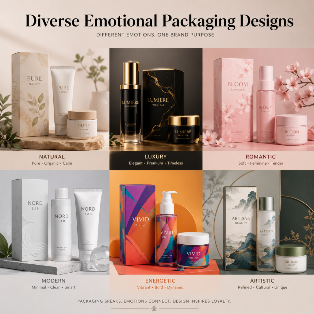
Color is a powerful tool in perfume box design, influencing emotions, perceptions, and purchase decisions. When used effectively, it enhances the packaging’s appeal and connects deeply with consumers.
Perfume box designs leverage color psychology to evoke emotions, align with scent profiles, and communicate brand identity, ensuring a compelling and memorable packaging experience.
Let’s uncover the strategies behind color in perfume packaging.
Evoke Emotions with Color
Colors can evoke specific feelings, setting the tone for the fragrance inside.
Soft pastels suggest romance, bold reds ignite passion, and cool blues exude calmness and sophistication, creating a direct emotional connection with the consumer.
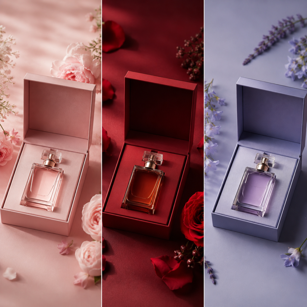
For example, a perfume with floral notes might use blush pink or lavender hues to convey softness and romance. Meanwhile, a fragrance with spicy or exotic notes could use deep reds or burgundy to evoke intensity and passion.
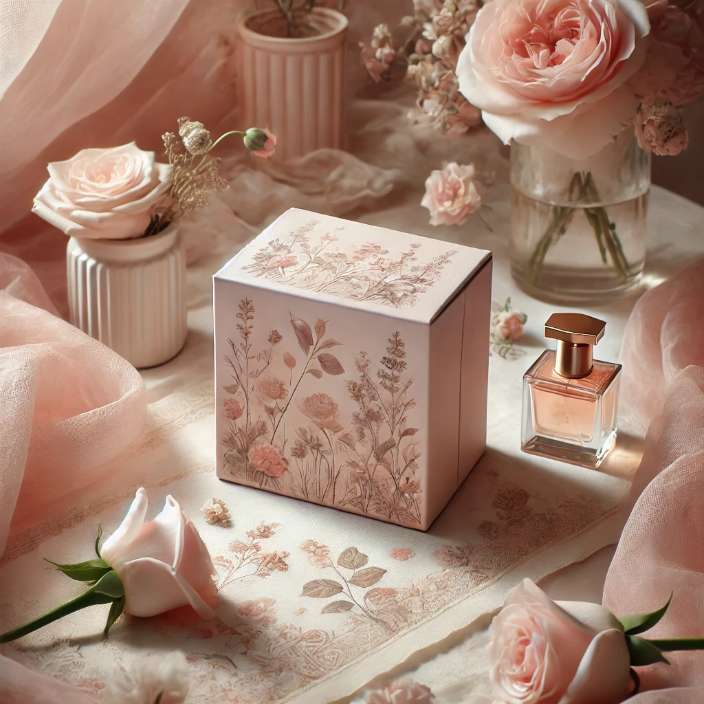
This intentional use of color helps set expectations for the fragrance, enhancing the customer’s overall sensory experience and building an emotional connection before the unboxing begins.
Align Colors with Fragrance Families
Matching colors to scent profiles strengthens the association between the packaging and the fragrance.
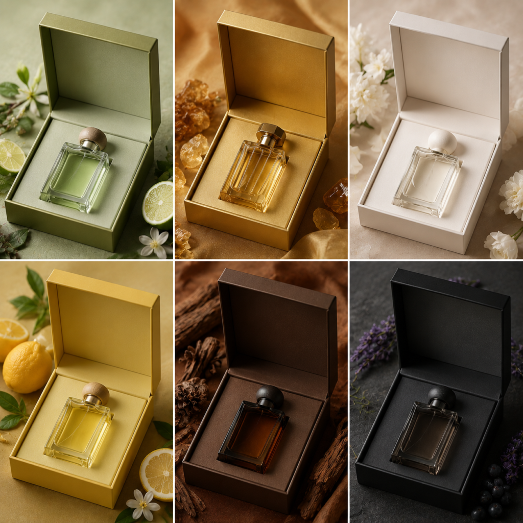
Green tones signify freshness and herbal notes, gold represents opulent and oriental scents, and white reflects clean, minimalistic fragrances.

For instance, perfumes with citrus or grassy notes may feature vibrant green or yellow hues, while woody or musky fragrances could incorporate rich browns or blacks. Oriental fragrances often use luxurious gold or deep jewel tones, aligning with their exotic profiles.
This alignment helps consumers intuitively understand the scent type, simplifying their selection process and enhancing their perception of the product.
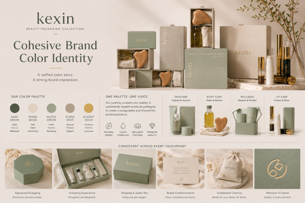
Communicate Brand Identity Through Palette
Consistent color palettes strengthen brand recognition and ensure cohesion with the product’s luxury appeal.
Using signature brand colors across designs reinforces identity while allowing flexibility to reflect the unique attributes of each fragrance.
Luxury brands like Chanel often maintain a signature palette (e.g., black and white) that resonates with their iconic identity. However, they may incorporate additional colors, textures, or finishes to distinguish specific collections while staying true to their aesthetic.
This consistency creates trust and familiarity, ensuring that packaging reflects the brand’s ethos while adapting to new trends or campaigns.
Use Contrasts to Highlight Key Features
Contrasting colors and finishes create focal points that draw attention to key design elements.
Dark and light tones or matte and glossy finishes emphasize logos, product names, or intricate patterns, adding depth and interest.
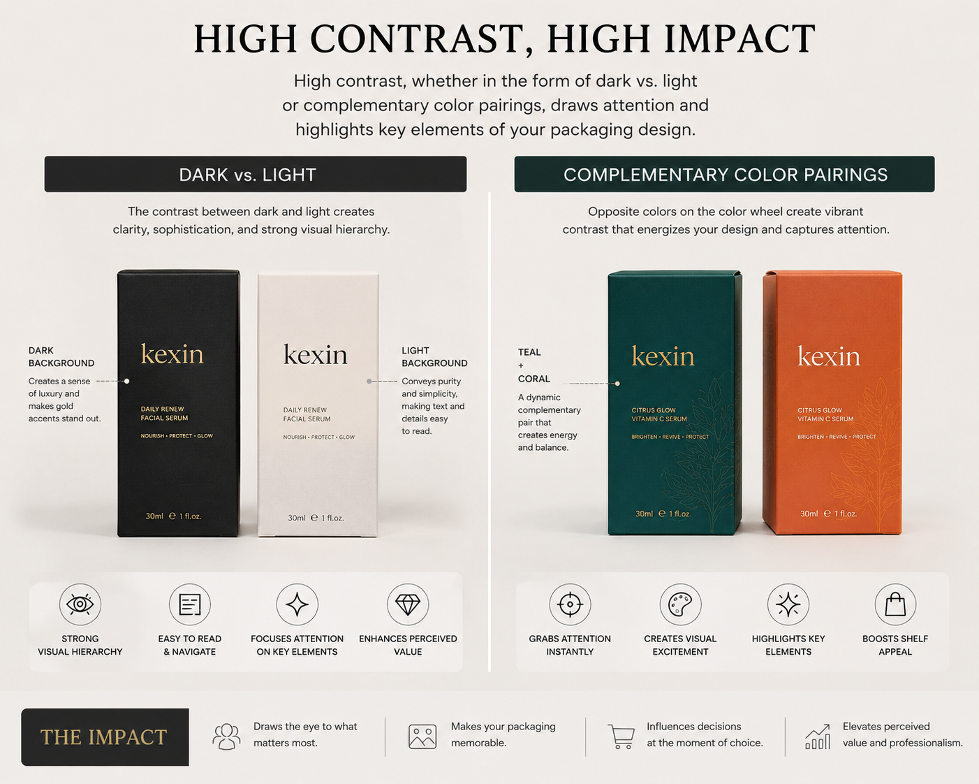
For example, a matte black box with a glossy gold logo or white packaging with bold, metallic lettering ensures important details stand out. These contrasts can also guide the consumer’s eye across the packaging, enhancing its visual impact.
This technique reinforces the luxury feel while ensuring practical elements, like branding or product descriptions, are easily noticeable.
Create Seasonal and Limited-Edition Appeal
Seasonal and limited-edition designs benefit from vibrant, trend-specific color schemes.
Warm tones like amber and rust suit fall collections, while bright, sunny yellows or blues align with summer fragrances, creating exclusivity and relevance.
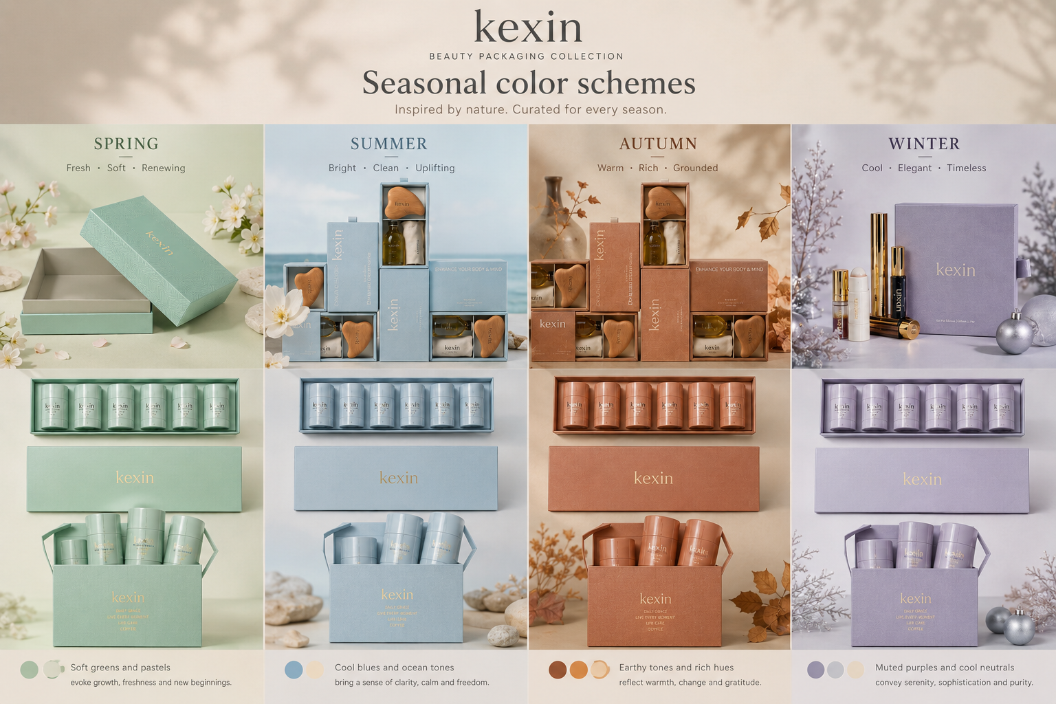
Brands can use holiday-inspired palettes, such as red and gold for Christmas, or soft, pastel shades for spring launches. Seasonal colors create excitement and urgency, encouraging consumers to collect limited editions.
This adaptability allows brands to connect with seasonal trends while maintaining their unique identity.
Enhance Perceived Value with Metallics
Metallic accents instantly elevate the luxury perception of perfume packaging.
Gold, silver, or rose-gold finishes suggest opulence and prestige, appealing to consumers seeking premium products.
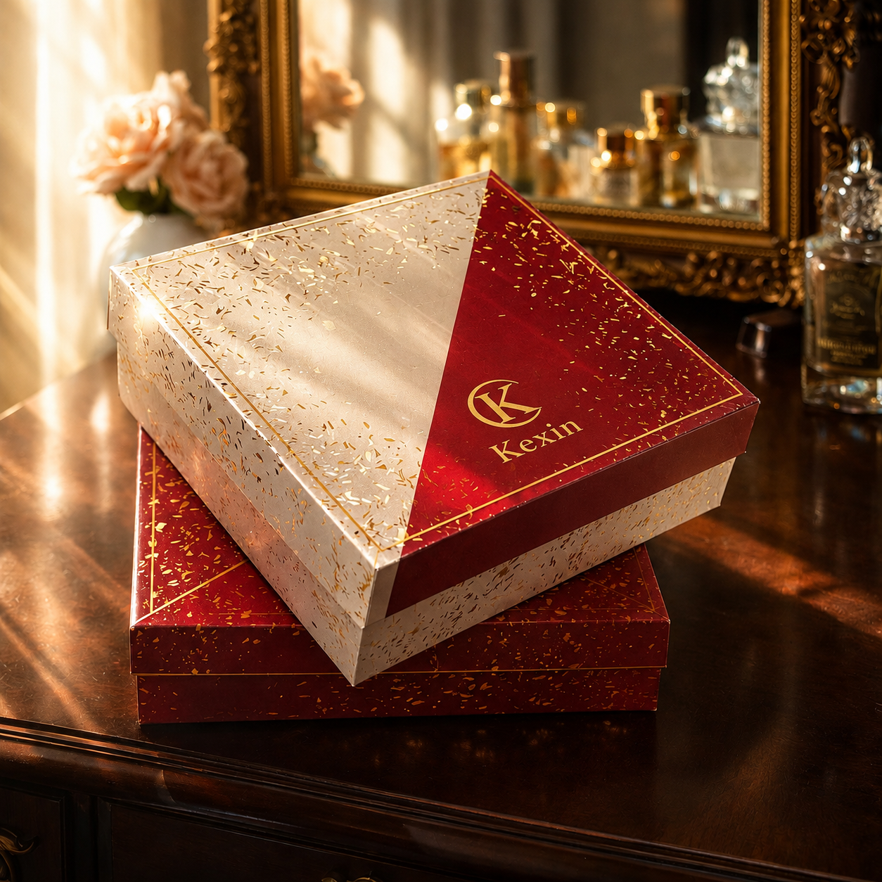
Gold foiling, metallic embossing, or reflective surfaces are commonly used on logos or borders, creating a sophisticated and high-end appearance. Pairing metallics with matte or textured finishes adds depth, further emphasizing the premium quality of the product.
This approach targets high-end buyers who associate metallic tones with exclusivity and elegance, reinforcing the perfume’s value.
Conclusion
The strategic use of color in perfume box design evokes emotions, aligns with scent profiles, and enhances brand recognition, creating a luxurious and captivating consumer experience.
And more…
We would love to assist you. If there’s more we can do for you, please feel free to contact us:
Quote request: Use the quote form
Phone: 15817411992