In the highly competitive world of cosmetics, packaging isn’t just about holding the product—it’s about capturing attention, creating emotions, and conveying your brand’s essence. The right colors can speak volumes, influencing consumers’ decisions long before they try the product itself.
The colors used in cosmetic packaging play a crucial role in branding and consumer behavior. By understanding the psychology behind color choices, brands can tailor their packaging to create emotional connections, reinforce brand identity, and influence purchase decisions.
In this article, we’ll explore how to use color strategically in cosmetic packaging to stand out on the shelves and resonate with your audience.
The Psychology of Colors: What Your Packaging Says About Your Brand
Colors communicate emotions and messages instantly. Each hue brings with it a certain set of associations, making color an essential tool for cosmetic packaging.
Colors can evoke powerful emotions and perceptions. For example, red signifies passion and energy, while blue conveys calmness and trust. Choosing the right color for your packaging sets the tone for your brand’s story.
In the world of cosmetics, color is more than an aesthetic choice; it’s a tool for aligning the product with consumer expectations. For instance, soft pinks and pastel hues often evoke feelings of femininity, gentleness, and beauty, while deep blues and greens may be linked with luxury or sophistication. Understanding the psychological effects of colors helps brands position themselves effectively in the market.
For example:
- Red often signifies passion, energy, and vitality. It’s commonly used in bold, striking packaging to create a sense of urgency or excitement.
- Blue is linked to tranquility, professionalism, and trust, making it ideal for skincare products that promise calm and rejuvenation.
- Gold and Silver suggest luxury, wealth, and exclusivity—perfect for high-end cosmetic lines.
By understanding these associations, you can select colors that not only attract attention but align with your product’s qualities and the message you wish to convey.
Best Color Palettes for Premium Cosmetic Packaging
When designing for high-end cosmetics, the right color palette is essential to communicate luxury and quality.
Premium packaging often utilizes rich, muted tones, metallic accents, and elegant color combinations to evoke a sense of exclusivity. Colors like deep plum, navy blue, and gold are staples for luxury products.
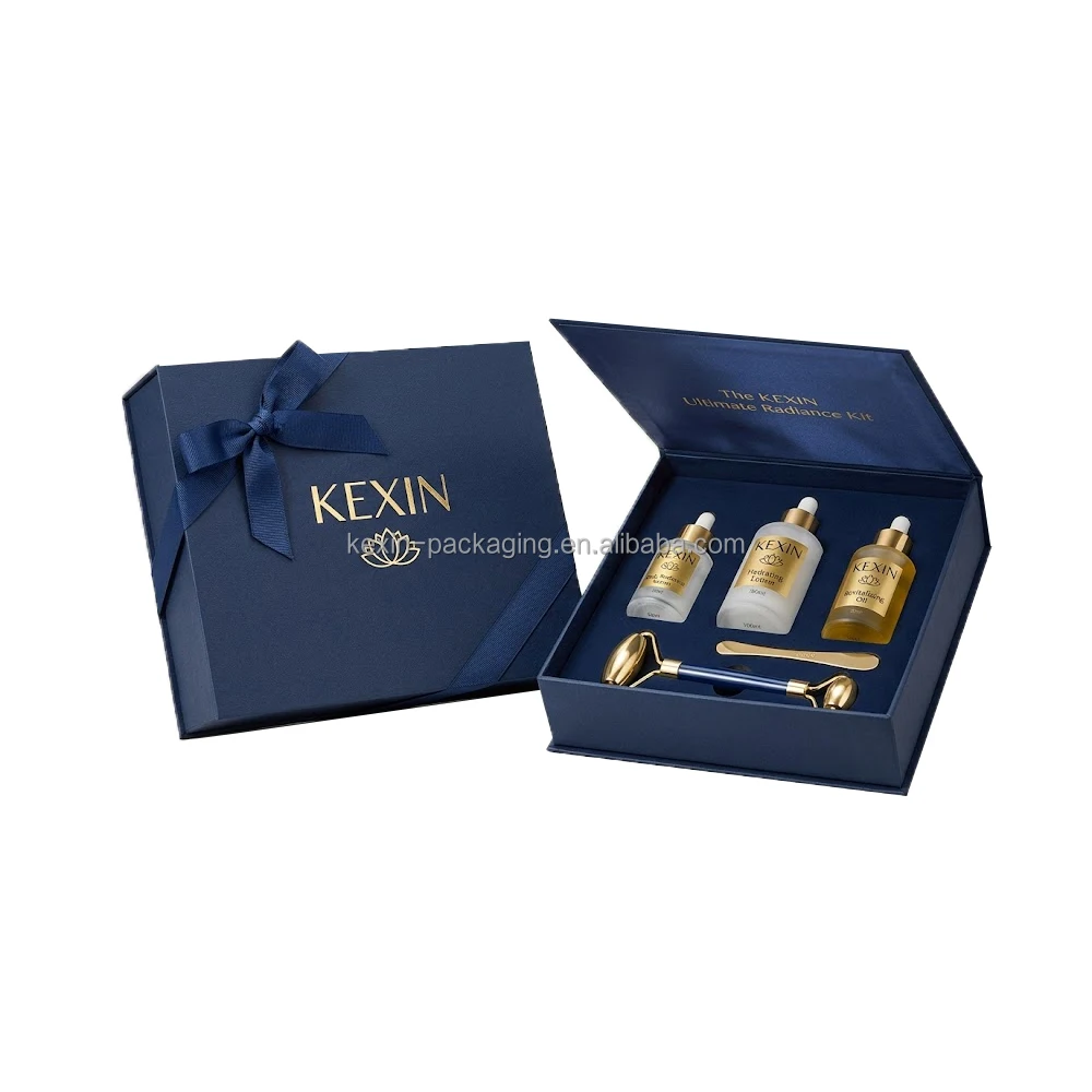
For premium products, it’s essential to opt for a refined, sophisticated color palette. Classic colors like black, gold, or silver immediately communicate a high-end vibe. Combining deep, muted tones with metallic accents creates a sense of sophistication without being overly flashy.
Popular choices for premium cosmetic packaging include:
- Navy Blue and Gold: A timeless combination that suggests both elegance and prestige.
- Charcoal Grey with Rose Gold: Provides a modern, luxurious feel while remaining understated.
- Burgundy and Cream: Evokes a sense of richness and classic beauty, perfect for premium skincare lines.
The key here is subtlety—avoid overusing bright colors that may feel too loud or cheap. Luxury brands focus on creating an emotional experience through packaging that hints at quality without overwhelming the senses.
How Cultural Preferences Impact Color Choices in Packaging
Different cultures associate colors with varying meanings, so it’s crucial to consider your target audience’s cultural background when designing cosmetic packaging.
Cultural preferences can greatly influence how colors are perceived. While white may represent purity in Western markets, it could symbolize mourning in other parts of the world.
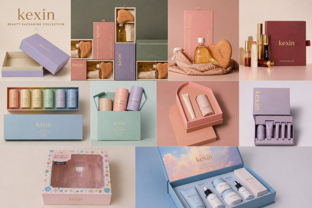
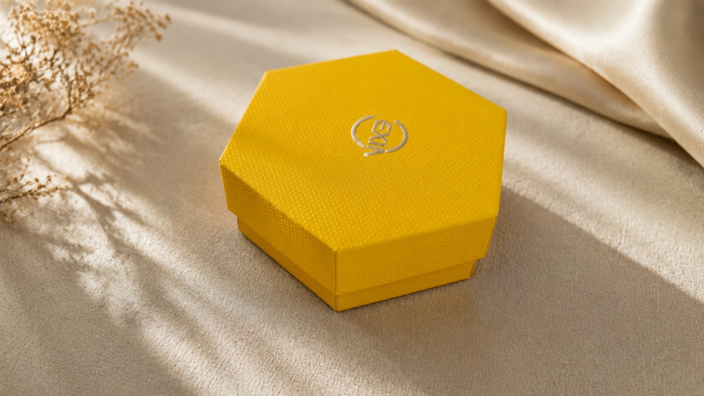
Below image is a cosmetic gift box collection created by one of our domestic clients for the Mid-Autumn Festival, filled with traditional Chinese aesthetics. In Chinese culture, red symbolizes prosperity, celebration, warmth, and reunion — making it the perfect color choice for the festive atmosphere and family reunion theme of the Mid-Autumn Festival.
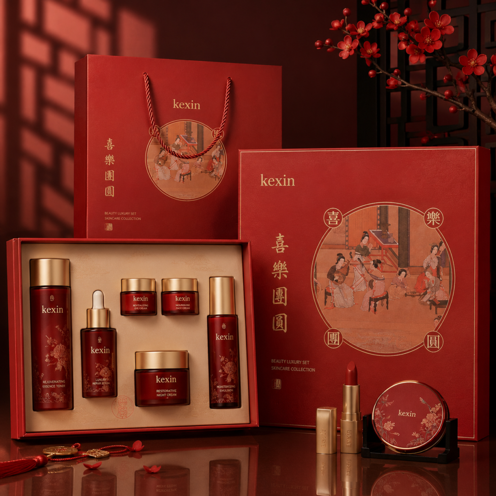
When launching products in diverse markets, understanding cultural color symbolism is key. For example, in China, red is associated with good fortune, making it a perfect color for packaging during the Chinese New Year. In contrast, black may be seen as negative or unlucky in some cultures but could convey sophistication in others, such as in the Western luxury market.
Designing globally appealing cosmetic packaging requires sensitivity to these cultural nuances. Researching local preferences and associations ensures that your product packaging resonates positively across various regions, rather than unintentionally causing offense or misunderstanding.
Using Color to Differentiate Product Lines
Color can serve as a powerful differentiator, helping consumers easily identify products from the same brand with distinct characteristics.
Different colors can highlight various product lines, helping customers navigate your offerings easily. For example, a skincare line might use soft greens for moisturizing products and vibrant oranges for products with more energizing or exfoliating properties.
By assigning different colors to different product lines, you can simplify the consumer decision-making process. For instance, if you have a line of anti-aging products, you might opt for muted, elegant colors like silver or navy, signaling maturity and sophistication. On the other hand, a younger, more vibrant line may feature bright, playful colors like coral or mint green.
Color allows for immediate recognition, helping build a clear visual language across your product range. It aids in creating a cohesive brand identity while allowing consumers to find exactly what they need at a glance.
Soft Pastels vs. Bold Shades: Which Attracts Your Target Audience?
The choice between soft pastels and bold, vibrant shades depends heavily on the type of consumer you’re targeting.
Soft pastels are often seen as calming and feminine, while bold shades can convey energy, youthfulness, or a cutting-edge brand personality.
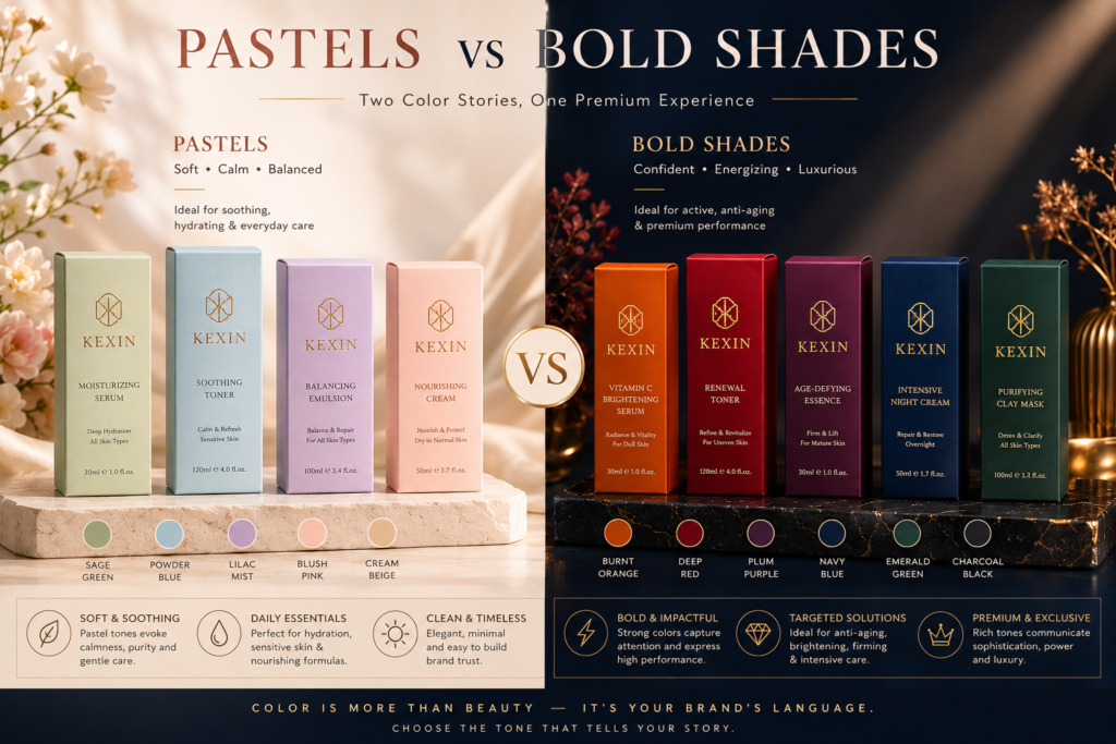
If you’re targeting a younger, trend-focused audience, vibrant, bold colors like electric pinks, cobalt blues, and neon greens can evoke energy and playfulness. On the other hand, if your brand targets a more mature, sophisticated market, soft pastels like lavender, mint green, or blush pink might appeal more for their gentle and elegant associations.
Matching your color choices with your brand’s personality and target demographic is key to creating packaging that resonates.
Metallic Accents: Adding Luxury Without Overdoing It
Metallic accents can elevate your packaging design and lend a touch of glamour, but balance is key to maintaining sophistication.
Metallic finishes, whether in gold, silver, or copper, add a luxurious feel to packaging without overwhelming the design. A little metallic goes a long way in making your product feel premium.
For high-end cosmetics, metallic accents such as gold or silver foil stamping can add a layer of refinement and exclusivity. The key is to avoid excessive use. Too much metallic detailing can quickly feel gaudy or overpowering. Instead, integrate metallic elements sparingly—such as a logo, trim, or border—to create a luxurious, premium finish.
The right metallic accents can help elevate a simple design, adding depth and shine without sacrificing the product’s overall elegance.
Neutral Tones in Minimalist Packaging: Timeless or Trendy?
Neutral tones have been a staple in packaging design for years. From beige to taupe to soft greys, these colors offer a clean, classic aesthetic.
Neutral tones can help create minimalist packaging that remains timeless. However, the minimalist trend is continually evolving, and the use of neutrals must be executed thoughtfully to avoid feeling outdated.
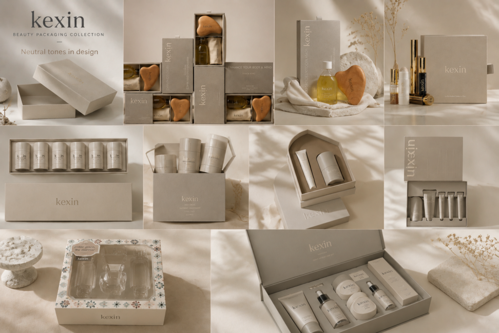
Neutral tones like white, beige, and grey can give packaging a sleek, modern appearance, often associated with minimalism. This design approach can appeal to consumers who favor simplicity and understated elegance. However, to avoid being seen as bland or uninspired, add texture, unique fonts, or a pop of color to bring the design to life.
Neutral colors can work well for skincare and wellness products, where the focus is on simplicity, purity, and efficacy. These colors create an inviting and calming look that can align well with organic or eco-conscious product lines.
How Seasonal Colors Can Boost Limited-Edition Sales
Colors linked to certain seasons can help create a sense of urgency and exclusivity for limited-edition product releases.
Using seasonal colors like deep reds and greens for winter or pastel tones for spring can generate excitement and drive sales for limited-edition products.
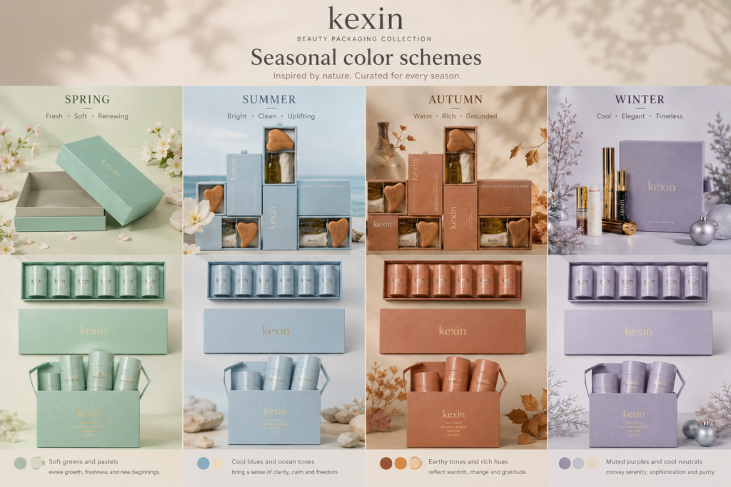
Seasonal colors create a sense of timeliness and exclusivity. For example, a holiday-themed collection could use rich golds, reds, and greens to capitalize on the festive spirit. Spring might feature soft pastel shades, invoking a sense of freshness and renewal.
By leveraging the psychology of seasonal color, you can boost interest in limited-edition products and generate urgency, encouraging customers to purchase before the product disappears.
Balancing Multiple Colors for a Cohesive Brand Identity
Using multiple colors in your packaging design can be effective if done strategically.
Multiple colors can work together to represent different aspects of your brand, but too many colors can overwhelm the consumer. A balanced color palette ensures consistency across your product line.
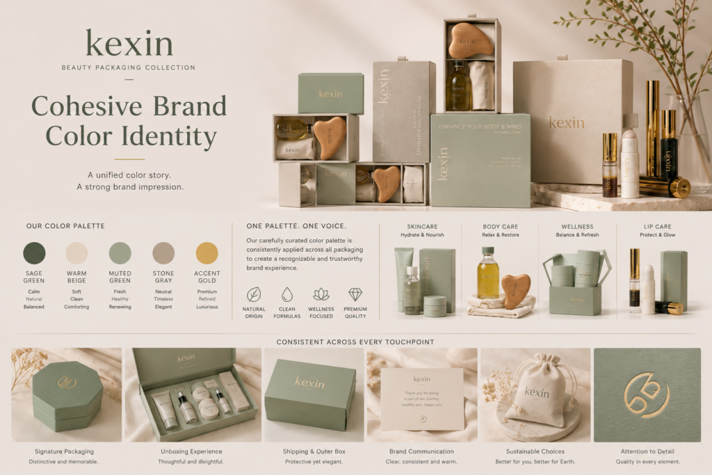
To maintain brand consistency, limit your color palette to two or three primary colors that reflect your brand identity. This approach creates a cohesive, recognizable look across all your products. A limited color palette also ensures that the packaging remains visually appealing without clashing or confusing the consumer.
If your brand is known for a bold, energetic image, use contrasting colors like red and black to stand out. On the other hand, a softer, more refined brand may use complementary colors, such as pale blue with white or gray, to create a harmonious, sophisticated look.
Matte or Glossy Finishes: Which Enhances Color Appeal?
The finish of your packaging—whether matte or glossy—can impact how colors appear and affect the consumer’s experience.
Matte finishes tend to soften colors and give a more sophisticated, understated look, while glossy finishes enhance vibrancy and make colors pop.
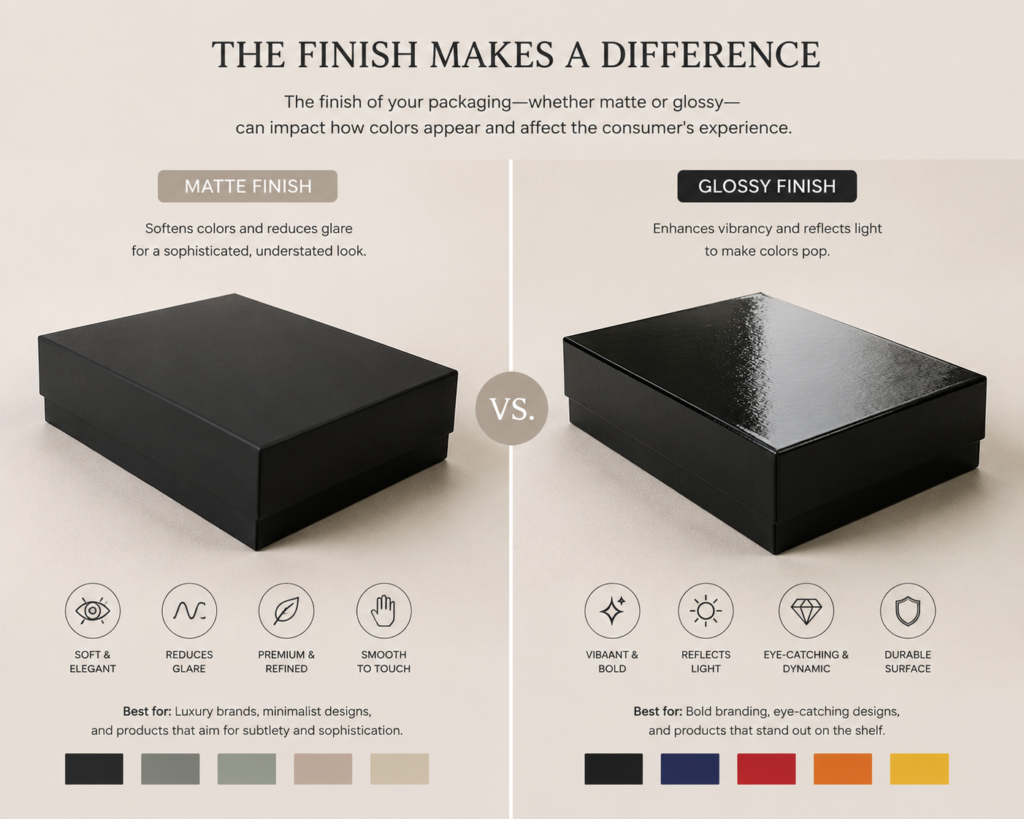
Matte finishes are often used for luxury or high-end cosmetics because they exude elegance and refinement. They create a tactile, premium experience while maintaining a calm, subtle color appearance. On the other hand, glossy finishes are ideal for packaging that requires attention-grabbing appeal, such as bold, vibrant products that need to stand out on crowded shelves.
Your choice between matte and glossy depends on your brand’s personality and the kind of message you want to communicate through color.
The Role of Contrast in Creating Eye-Catching Designs
Contrast is crucial for ensuring that your packaging stands out and catches the consumer’s eye.
High contrast, whether in the form of dark vs. light or complementary color pairings, draws attention and highlights key elements of your packaging design.
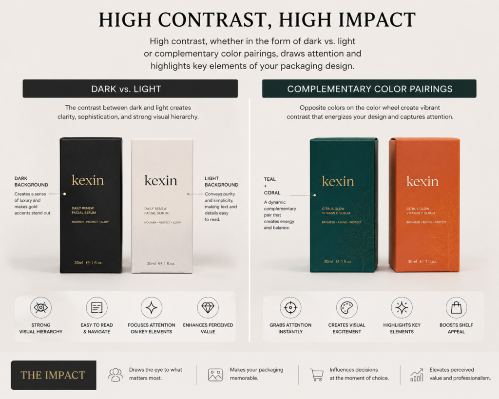
Using contrasting colors for the background and text or logo ensures that your brand name and product details are legible and noticeable. For example, a dark packaging color paired with bright or metallic lettering can create striking visual interest. Contrast helps to balance design elements, ensuring that the packaging doesn’t feel flat or unmemorable.
Designing Color Gradients for a Modern, Sophisticated Look
Gradients add depth and a modern touch to packaging designs.
Gradients, which blend two or more colors seamlessly, can convey sophistication and movement, making them perfect for contemporary cosmetic brands.
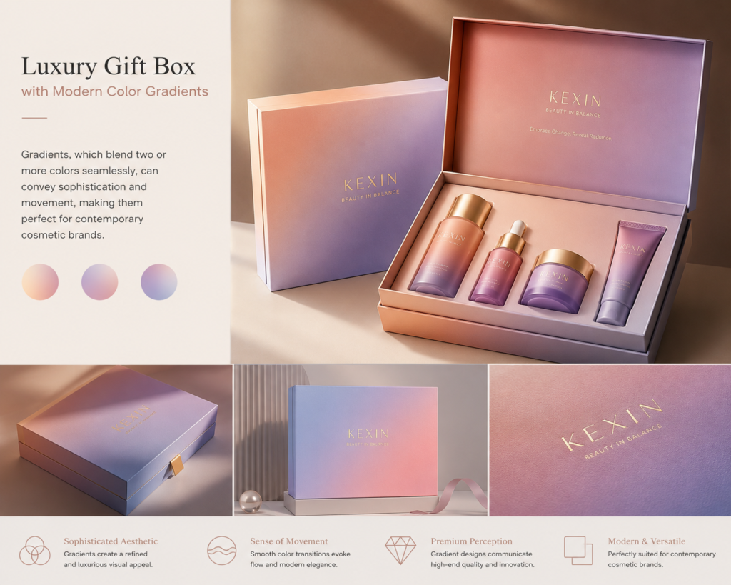
A smooth gradient can create a sense of fluidity, transitioning from one color to another in a visually appealing way. It can give packaging a sense of dynamism and complexity, ideal for brands targeting a modern, youthful audience. Pairing gradients with minimalist typography or logo designs can balance the modern aesthetic with elegance.
Leveraging Monochromatic Schemes for High-End Products
Monochromatic color schemes, where different shades of the same color are used, can create a clean and cohesive look.
Monochromatic packaging designs allow for a refined, elegant appearance without the distraction of multiple colors.
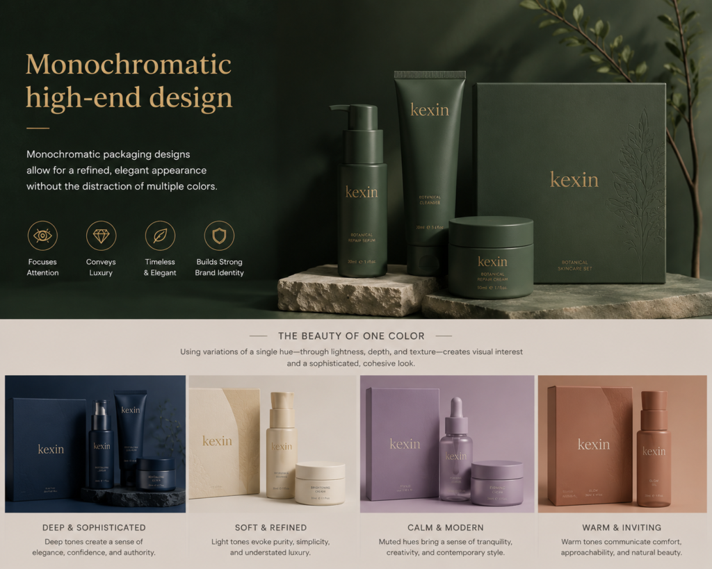
A monochromatic color palette can create an immersive, sophisticated feel, perfect for high-end cosmetics. For example, varying shades of deep plum or rose gold can evoke a luxurious aura without overwhelming the design. This approach is especially effective for brands focused on simplicity and elegance.
Color Trends in Cosmetic Packaging: What’s Hot This Year?
Staying up-to-date with color trends helps your products remain fresh and appealing.
Color trends evolve yearly, with Pantone’s Color of the Year influencing packaging design.
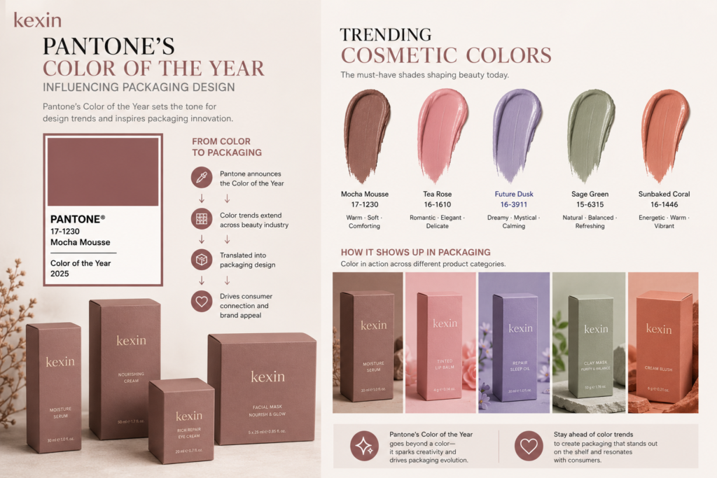
This year, colors like Ultra Violet, Living Coral, and Classic Blue are making waves in cosmetic packaging. These colors help brands stay relevant and tap into the cultural zeitgeist. Integrating trending colors into your packaging design can boost your product’s appeal and keep it looking modern and innovative.
Eco-Friendly Packaging: Communicating Sustainability Through Color
Sustainability is no longer just a trend—it’s a necessity.
Eco-friendly colors such as earth tones or shades that mimic nature—greens, browns, and muted blues—help communicate a commitment to the environment.
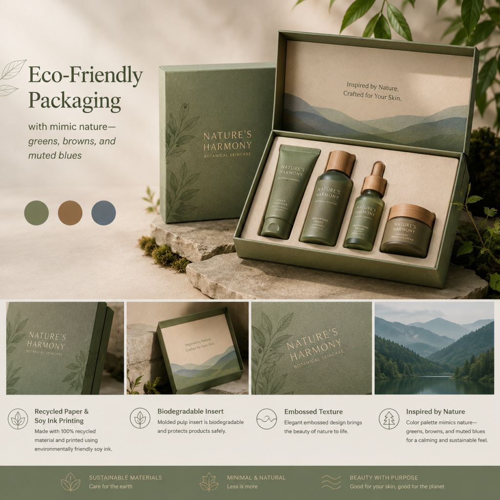
Brands opting for sustainable packaging often incorporate colors associated with nature to reinforce their commitment to eco-conscious practices. Whether it’s using recycled paper that’s a natural brown or using green tones to signify plant-based materials, colors can effectively communicate your eco-friendly values.
Would you like further assistance or have more questions about custom packaging? Feel free to reach out to us:
Quote request: Use the quote form
Phone: 15817411992