
IIn the packaging industry, “the color isn’t right” is one of the most common concerns we hear.
From buyers. From brand teams. And even from professionals who are new to packaging production.
Almost every time, the same question comes up:
“The artwork is correct — so why does the printed color look different?”
The reality is that color issues in packaging are rarely caused by a single mistake.
Much more often, they are the result of multiple variables interacting at the same time.
These variables include:
- The color system used (CMYK vs. Pantone)
- Paper material and surface characteristics
- Differences between screen display and printed output
- Finishing processes such as lamination or coating
- Printing equipment condition and production control
- Environmental factors like temperature and humidity
【Image suggestion here: Concept or infographic-style image showing multiple factors affecting printing color (paper, ink, machine, environment)】
Because of this, printing is not about achieving perfect color.
It is about achieving controlled, repeatable, and stable color under real production conditions.
Once this is understood, most color frustrations begin to make sense.
CMYK vs. Pantone: Where Color Problems Often Begin
Choosing the correct color system is critical. Many color issues originate before printing even starts.
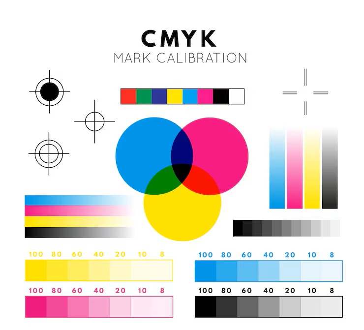
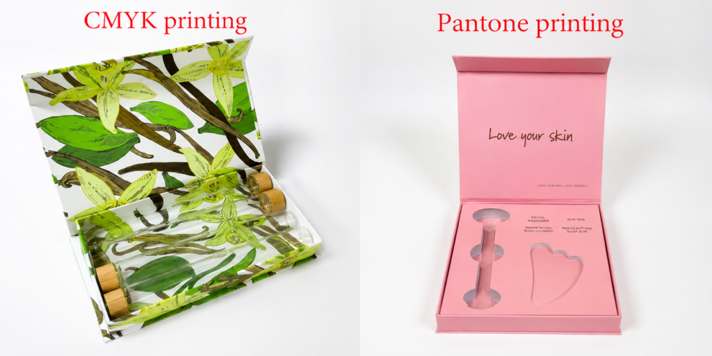
CMYK (Process Color Printing)
CMYK uses four inks — Cyan, Magenta, Yellow, and Black — layered in different percentages to create colors.
Advantages:
- Ideal for photos, gradients, and complex artwork
- Cost-effective for multi-color designs
- Widely used and flexible
Limitations:
- Color precision is limited
- Solid colors may appear uneven
- Sensitive to paper type and press conditions
CMYK is a reproduction method, not an exact color-matching system.
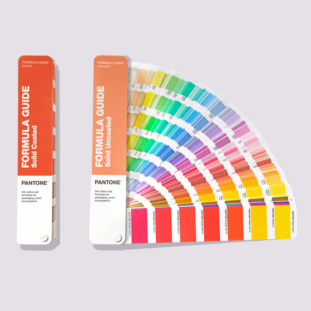
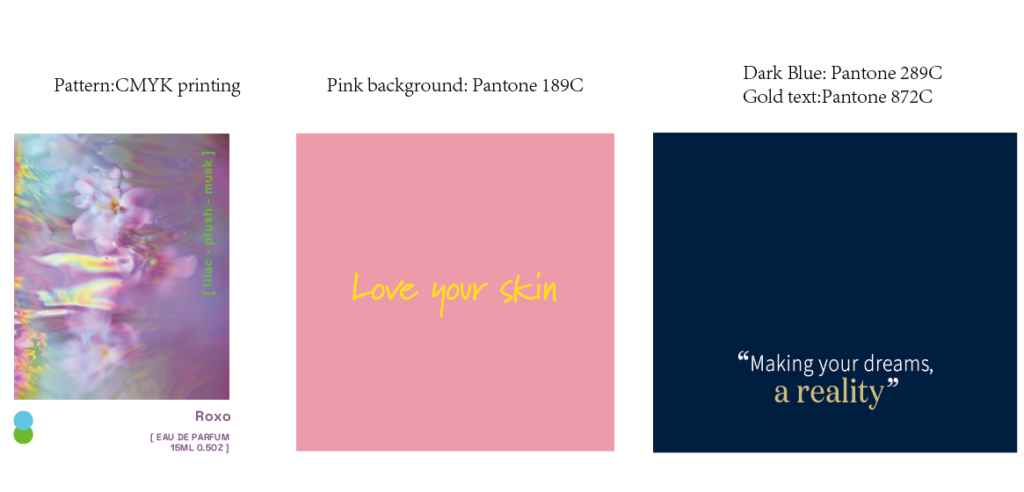
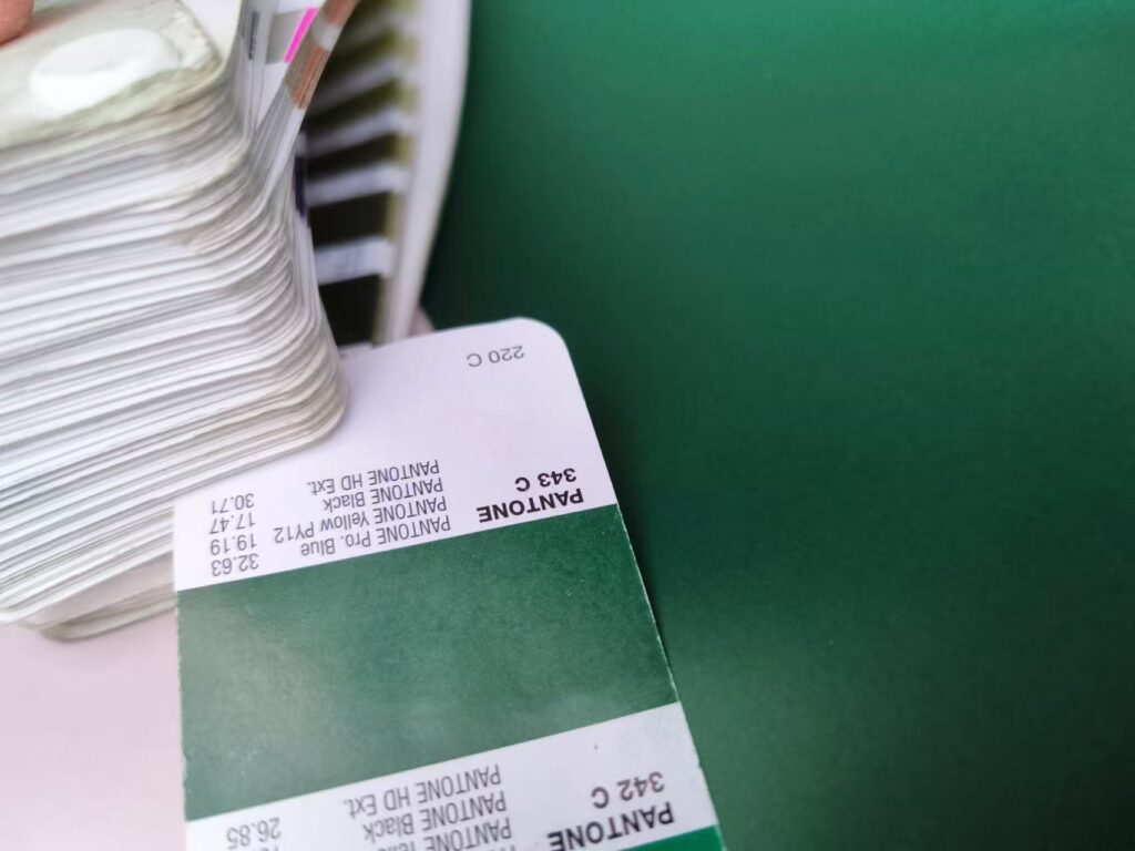
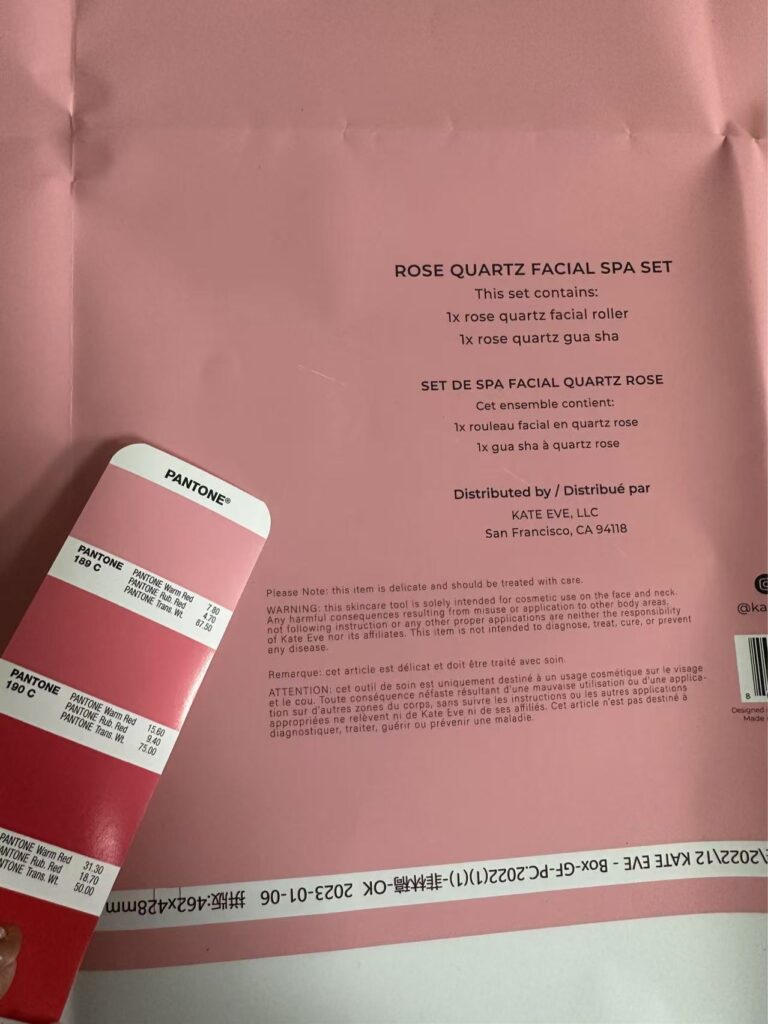
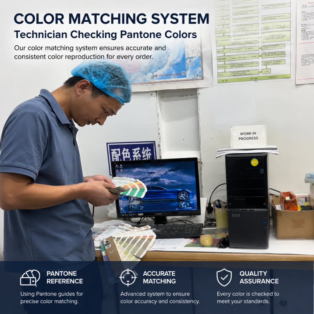
Pantone (Spot Color Printing)
Pantone uses pre-mixed inks, each identified by a specific Pantone code.
Advantages:
- Higher color consistency
- Stronger control for brand-specific colors
- Ideal for large solid color areas
Considerations:
- Higher cost than CMYK
- Less flexible for photo-heavy designs
Pantone is the preferred option when color accuracy is critical.
How We Decide Between CMYK and Pantone in Real Projects
In real packaging projects, this decision is usually made as soon as artwork is reviewed:
- Photo-heavy or gradient-rich designs → CMYK
- Single background colors or large solid areas → Pantone recommended
- 2–3 clearly defined colors with high brand sensitivity → Pantone strongly advised
Pantone involves higher cost, but it significantly reduces color uncertainty — especially for logos and brand identity elements.
Typical Decision Scenarios
Brand-sensitive designs with limited colors → Pantone strongly recommended
Photo-heavy or gradient designs → CMYK
Large solid color backgrounds → Pantone
Color Proofing: Setting the Right Expectations
CMYK Projects
Color is usually confirmed through digital proofs.
For projects with moderate color sensitivity, production printing is adjusted to match the approved proof.
For color-critical projects, multiple proof rounds may be required to align expectations.
Pantone Projects
Pantone colors must be confirmed using Pantone color codes or press samples.
Different paper types will affect appearance, but the reference standard must remain consistent.
Some clients choose to skip press samples for cost reasons and rely solely on Pantone swatches.
Regardless of the method, expectations must be aligned early.
It’s also important to be realistic:
In professional packaging production, 80–90%+ color matching is considered controlled, acceptable, and industry standard.
Absolute 100% visual identity is not achievable in physical printing.
| Item | CMYK | Pantone |
|---|---|---|
| Color accuracy | Moderate | High |
| Cost | Lower | Higher |
| Best for | Photos, gradients | Solid colors, branding |
| Consistency | Variable | Stable |
Why the Same Color Looks Different on Different Paper
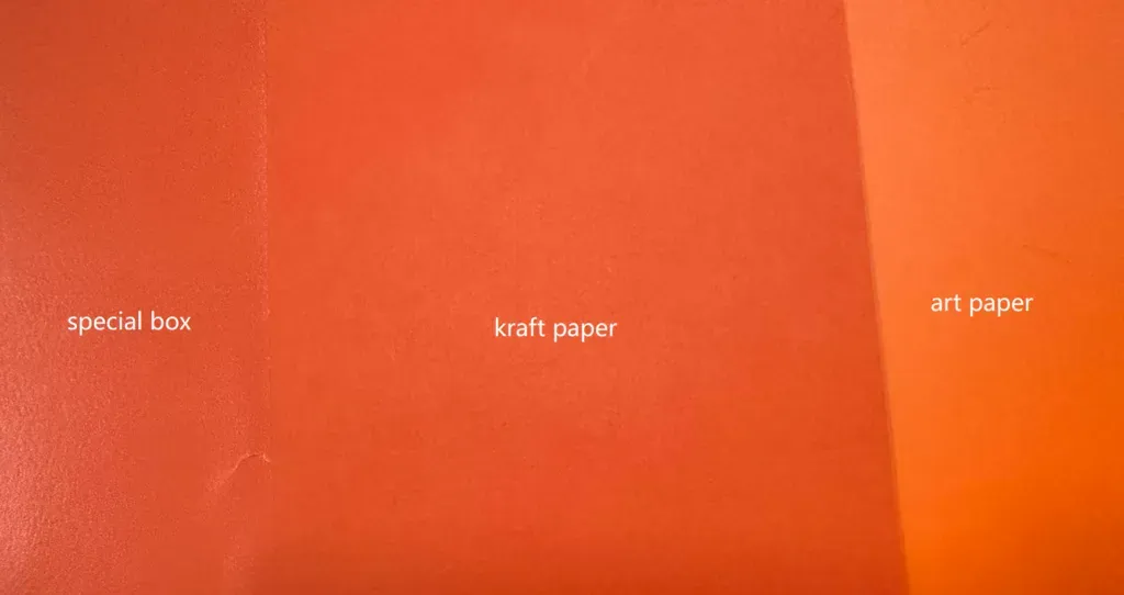
This is one of the most misunderstood aspects of packaging printing.
Paper is not a neutral background.
Paper is part of the color.
Different papers interact with ink in very different ways:
- Coated paper: ink stays on the surface → brighter, sharper colors
- Kraft paper: ink absorbs into fibers → darker, warmer, sometimes grayish tones
- Textured or specialty paper: surface texture scatters light → softer, less uniform color
The same ink on different paper stocks can legitimately produce very different visual results — without any production error.
The paper simply behaves as it is designed to.
Screens, Digital Proofs, and Press Samples
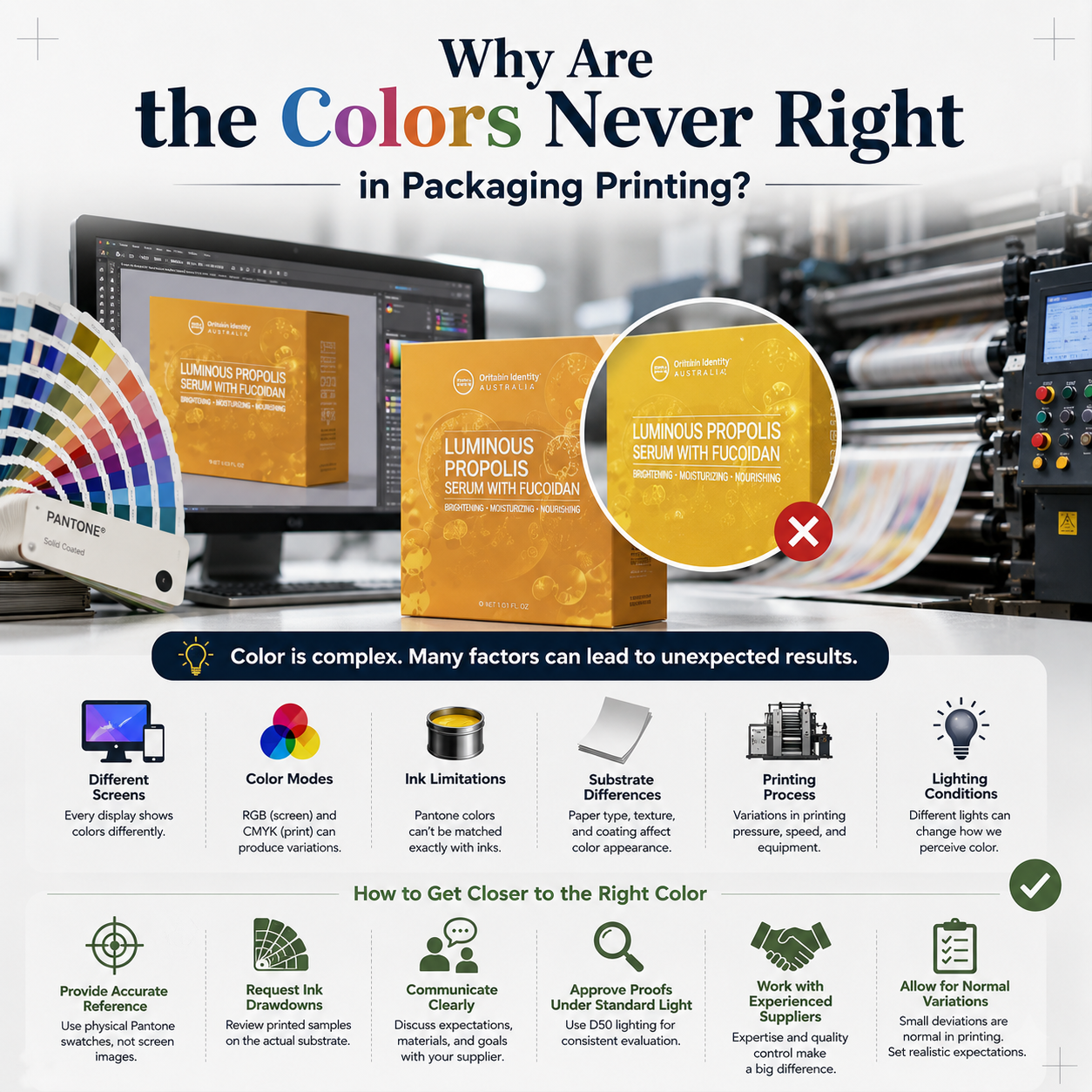
The same design can appear differently on different monitors, as shown in the image below.
Likewise, the same design can produce different color results depending on the printing method. In the image below, you can see that the digital proof appears brighter, while the offset-printed sample shows more refined and accurate color reproduction.
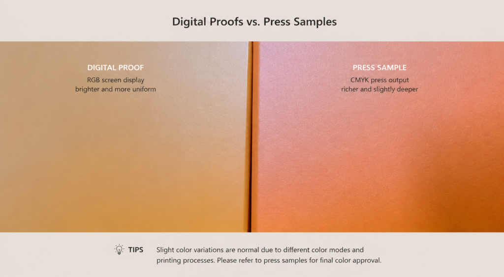
Digital proofs are essential — but they are references, not guarantees.
Why?
- Screens display color using light (RGB)
- Printed color relies on reflected light
- Monitor brightness, color temperature, calibration, and age affect perception
- Ambient lighting changes how the human eye sees color
Even calibrated screens cannot fully predict printed results.
When color accuracy truly matters, press samples remain the most reliable confirmation.
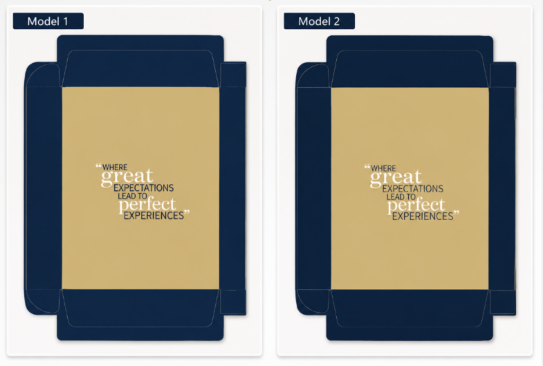
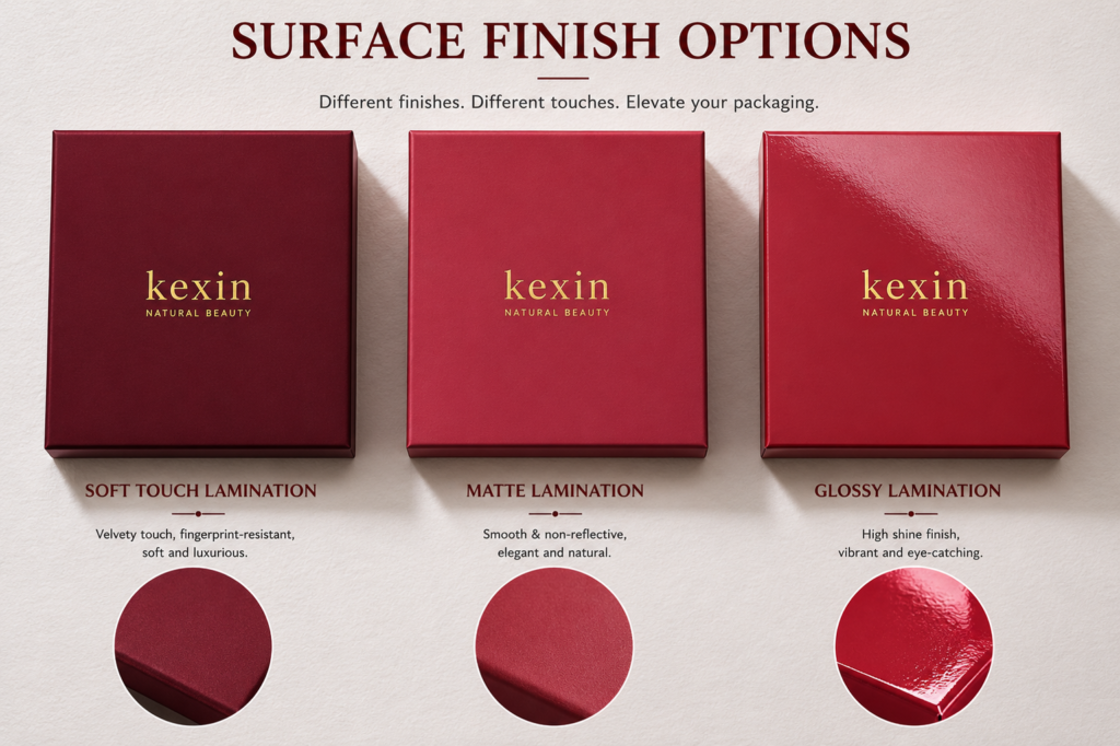
How Finishing Processes Quietly Change Color
Many color “surprises” occur after printing is complete.
Finishing processes change how light interacts with the surface:
- Gloss lamination → deeper, more saturated colors
- Matte lamination → softer contrast, muted tones
- Anti-scratch film → slightly darker appearance, lower saturation
This is why color approval should always consider final finishing conditions, not just printed sheets.
Why Dark and Black Packaging Is the Hardest to Control
Black may look simple, but it is one of the most demanding colors to produce well.
Dark colors magnify every imperfection:
- Uneven ink coverage
- Color banding
- Visible scratches and fingerprints
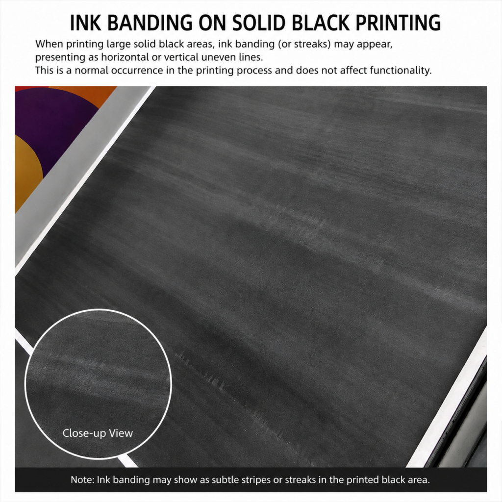
High-quality dark packaging requires stable ink flow, well-maintained equipment, sufficient drying time, and strict handling control.
Environmental Factors: Always Present, Rarely Discussed
Printing is a physical process — and the environment always plays a role:
- Humidity affects drying speed
- Paper grain influences ink spread
- Machine temperature affects ink viscosity
Even with identical files and inks, results may vary under different conditions.
This is not failure — it is the nature of printing.
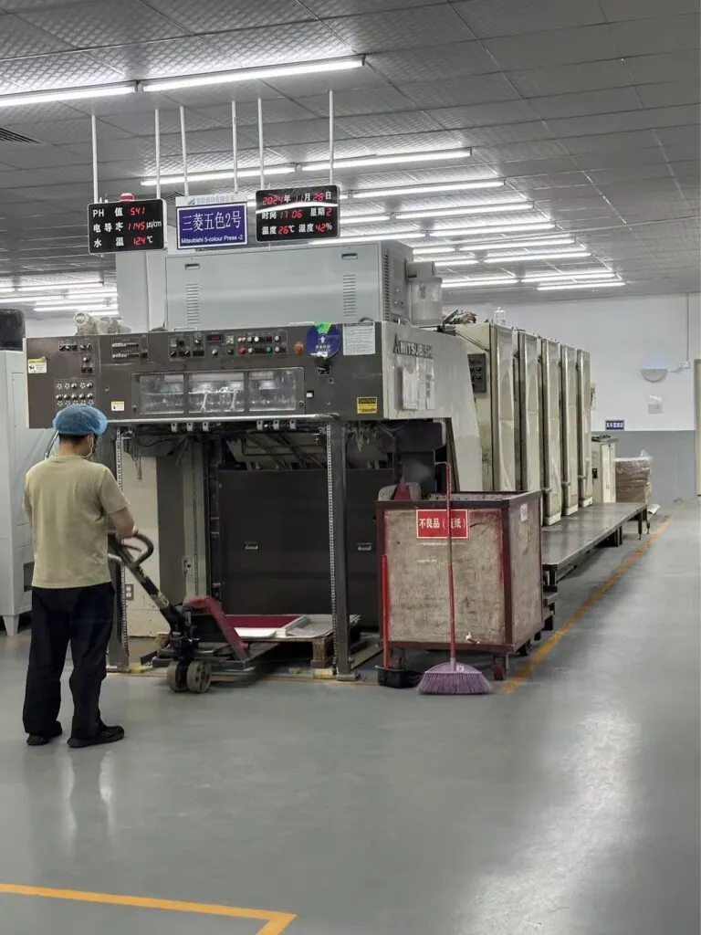
How Professional Factories Control Color Consistency
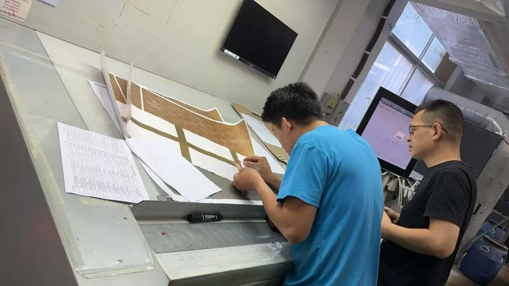
Reliable packaging factories do not rely on luck.
They rely on systems.
At Kexin, color consistency is managed through structured processes:
- Regular press calibration
- Ink density monitoring
- In-process QC inspections
- Sample archiving for batch comparison
Color is not “accidentally right.”
It is continuously managed.
Conclusion
Color differences in packaging are not signs of failure — they are the result of multiple interacting variables.
With the right color system, materials, proofing, and expectations, color variation can be effectively controlled.
The earlier color management begins, the smoother production becomes — and the lower the overall risk.