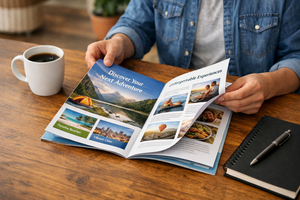
Creative Brochure Layouts and Catalog Design Ideas to Boost Engagement
Smart Layout Strategies That Guide Readers and Hold Attention
I’ve seen beautiful brochures fail—and simple ones win.
The difference is rarely printing quality. It’s layout.
A smart brochure or catalog layout guides the eye, reduces effort, and helps readers quickly understand value. When layout works, people keep reading. When it doesn’t, even the best content gets ignored.
Let’s break down how layout choices quietly turn browsers into buyers.
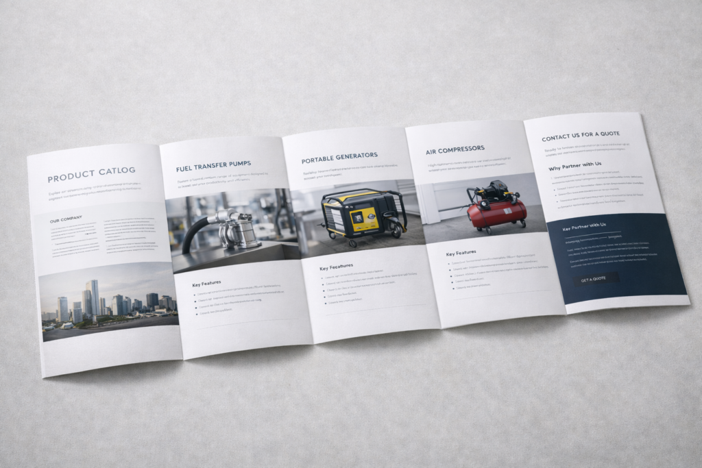
Catalog Design Techniques That Turn Browsers into Buyers
Most catalogs are skimmed, not read. That’s the reality.
Effective catalog layouts lead readers step by step—from interest to trust to action—without feeling pushy or overwhelming.
I often tell clients this:
Your catalog is not a book. It’s a conversation.
Strong layouts do three things well:
- They slow the reader down at the right moments
- They highlight what matters, not everything
- They reduce thinking effort
In real projects, we see higher engagement when:
- One page focuses on one key idea
- Images and text don’t fight for attention
- Calls-to-action are visually separated, not buried
A catalog that sells doesn’t shout.
It gently guides.
How Visual Hierarchy Makes Your Brochure Easier to Read and Remember
If everything looks important, nothing feels important.
Visual hierarchy helps readers know where to look first, second, and last—without thinking about it.
When I review a brochure, I squint at it first.
If I can’t tell what the main message is in three seconds, the layout needs work.
Good hierarchy usually means:
- Clear headline size difference
- Strong contrast between titles and body text
- Images supporting the message—not distracting from it
Here’s a simple rule we use internally:
One hero, a few supporters, no crowd.
That’s how information becomes memorable.
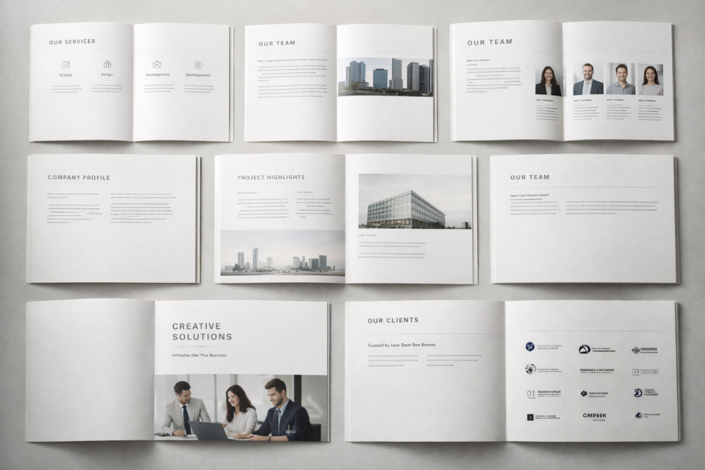
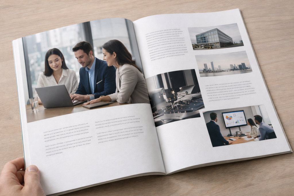
Modern Grid Systems That Bring Clarity and Flow to Your Content
Grids are invisible—but you feel them when they’re missing.
Modern grid systems create rhythm, alignment, and flow, making content feel calm and professional.
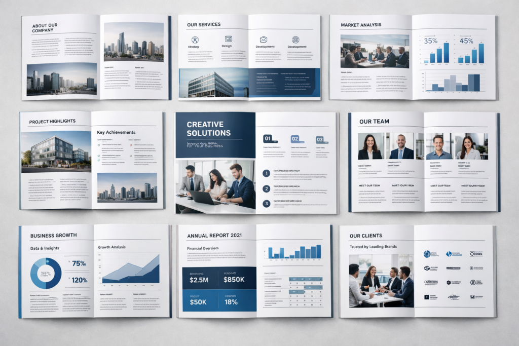
A grid doesn’t limit creativity.
It protects it.
With a good grid:
- Pages feel balanced
- Content looks intentional
- Updates become easier later
For catalogs especially, grids help when:
- Product numbers grow
- Languages change
- New pages are added
It’s one of those design decisions customers never notice—but always feel.
Using Typography and White Space to Elevate Brand Perception
Fonts speak before words do.
Thoughtful typography and white space make a brand feel confident, premium, and trustworthy.
I’ve seen brands upgrade perception instantly by doing less:
- Fewer fonts
- More spacing
- Shorter text blocks
White space isn’t empty space.
It’s breathing room.
When text has space, readers relax.
When readers relax, they stay longer.
That’s not design theory—that’s human behavior.
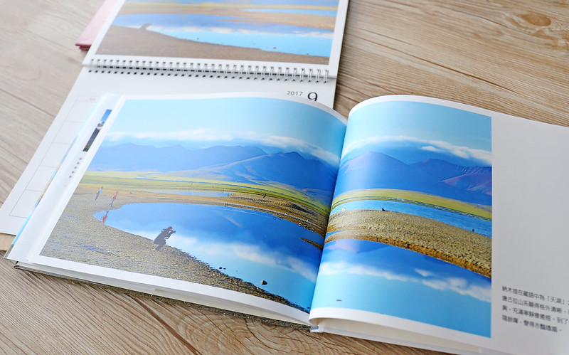
Creative Page Structures That Tell Your Brand Story Visually
People remember stories, not specifications.
Creative page structures help turn dry information into a visual journey that feels human and engaging.
Instead of stacking content top to bottom, we often:
- Break pages into sections
- Use visual pauses
- Let images “lead” the story
One client told me,
“I finally understand our own catalog now.”
That’s a win.
Design Details That Improve Navigation and User Experience
Good navigation is quiet. Bad navigation is loud.
Clear page numbers, visual anchors, and consistent section styles help readers move smoothly through content.
Small details matter:
- Repeating headers
- Color-coded sections
- Clear product groupings
These details save time—and respect the reader.
From Minimal to Bold: Layout Styles That Match Different Brand Personalities
Not every brand should look “clean and minimal.”
The best layout style reflects your brand personality—whether calm, bold, playful, or technical.
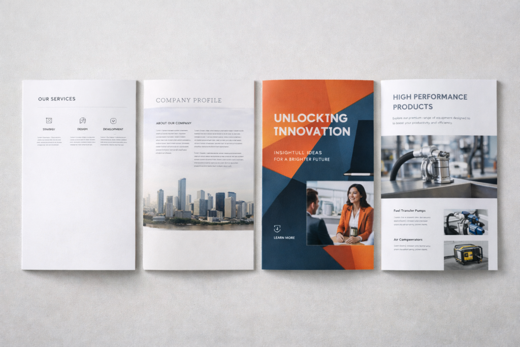
Here’s how I usually guide clients:
| Brand Style | Layout Direction |
|---|---|
| Luxury | Minimal, spacious |
| Tech | Structured, grid-based |
| Creative | Bold visuals, movement |
| Industrial | Clear, functional |
Design should feel right, not trendy.
How Consistent Layout Design Builds Trust and Professionalism
Consistency is quiet proof of professionalism.
When layouts stay consistent, brands feel reliable—even before reading the content.
Consistent layouts:
- Reduce confusion
- Improve recognition
- Build long-term trust
Especially for B2B buyers, consistency signals control—and reliability.
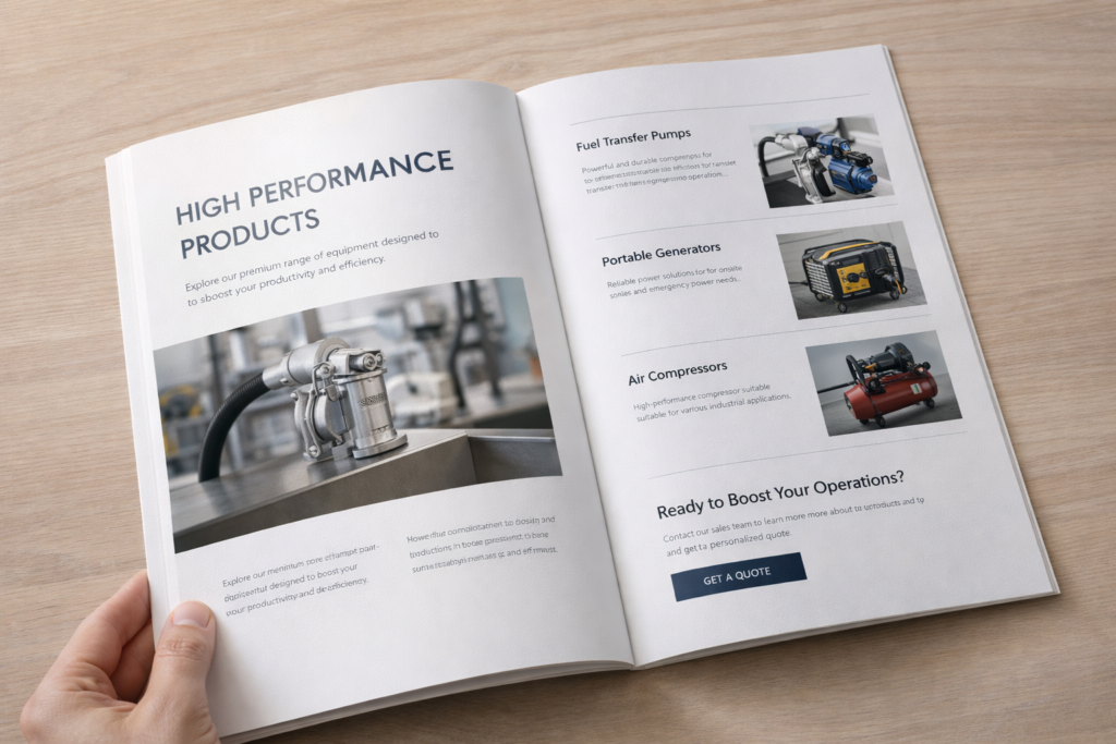
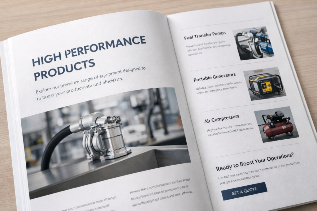
Print Design Ideas That Increase Engagement and Response Rates
Print still works—when done right.
Smart layouts increase engagement by making printed materials easier to explore and faster to understand.
We often see better response when brochures:
- Invite flipping, not reading
- Highlight benefits visually
- End with clear next steps
Good print design doesn’t fight digital.
It complements it.
Conclusion
A strong layout doesn’t decorate content.
It helps your message land—and stay.