Today, a colleague and I ordered takeout. We hadn’t even tasted the food yet, but the packaging had already shaped my expectations.
My colleague’s order arrived in a thick green woven carry bag with the restaurant’s branding. It immediately made the restaurant look professional, clean, and trustworthy. Naturally, I assumed the food would be good.
Then I looked at my own order. It came in a plain white plastic bag. The first impression was completely different—cheap, roadside stall, questionable quality.
It made me think: if a restaurant isn’t willing to invest a little care in its packaging, how can customers expect the same care in the food?
I probably wouldn’t order from that restaurant again. And clearly, many consumers think the same way.
This simple experience shows one thing: good packaging strongly influences a brand’s image and even its sales.
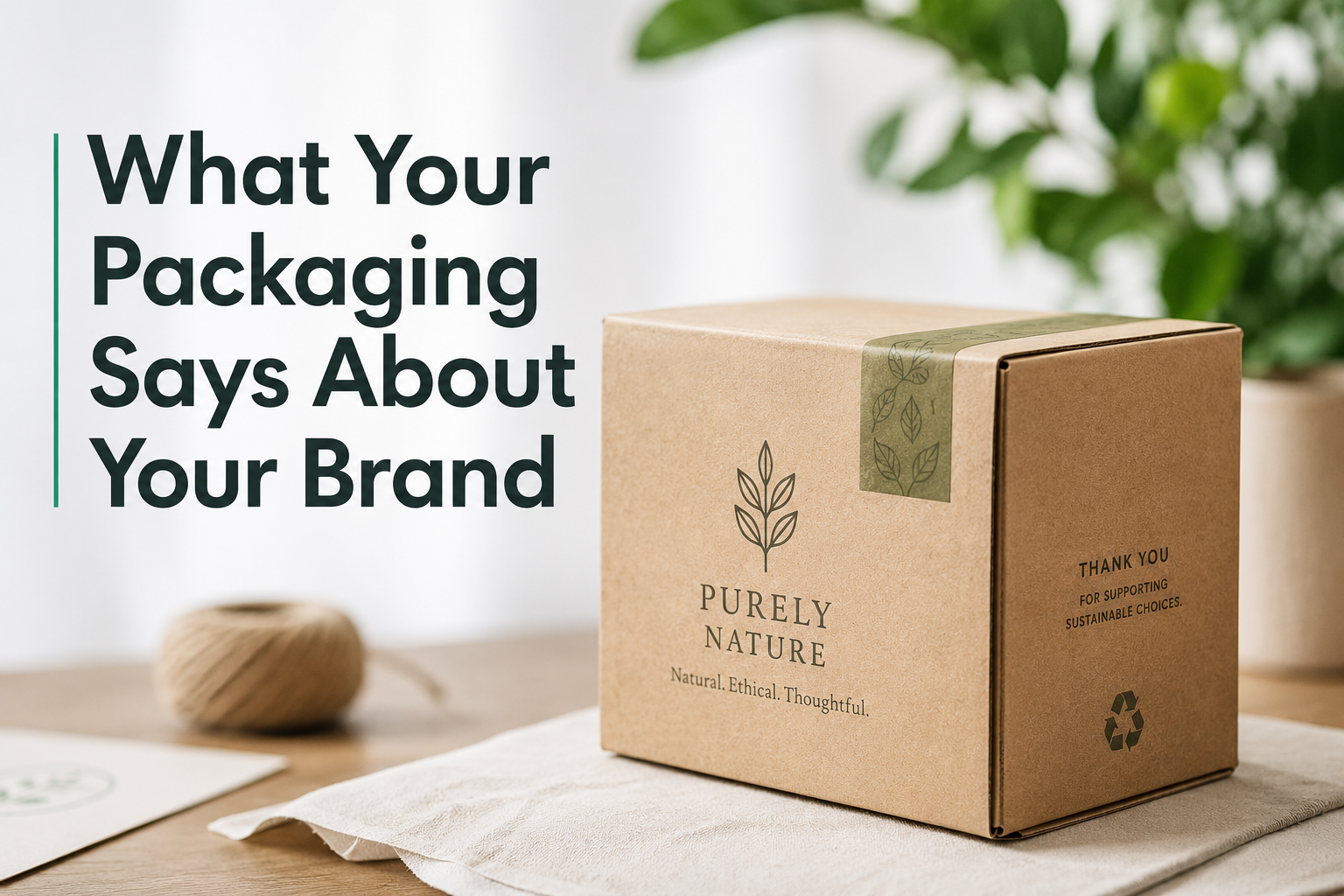
What does your packaging say about your brand? More than you think. Packaging isn’t just a container—it’s a conversation, a first impression, and often, the deciding factor for consumers.
Your packaging design communicates your brand’s personality, values, and promise at first glance. From colors and fonts to materials and textures, every design choice tells a story. Make it count by aligning your packaging with your brand identity to build trust and stand out.
Let’s dive deeper into how packaging speaks volumes about your brand.
How Packaging Influences First Impressions of Your Brand
Your packaging design is often a customer’s first interaction with your product. Make it memorable.
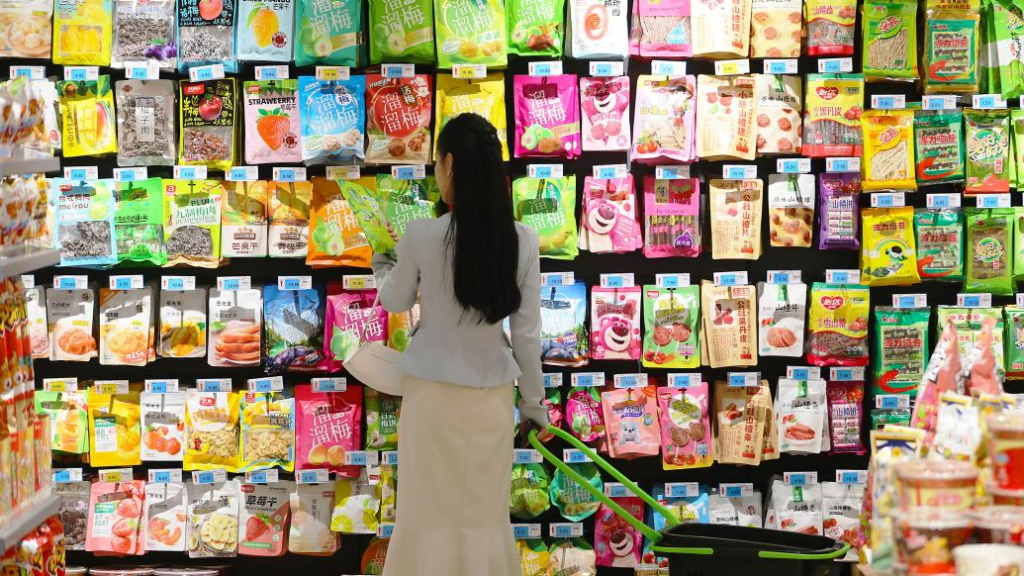
Packaging heavily influences brand perception by shaping first impressions. Eye-catching visuals, quality materials, and clear messaging immediately tell customers if your brand is premium, playful, or eco-conscious. Get this right, and you’re halfway to a sale.
Just like the small story mentioned earlier, the food from two restaurants may actually be quite similar. However, packaging with better design and slightly higher-quality materials can make consumers feel that the overall experience is completely different.
A polished design signals professionalism, while a creative touch can evoke curiosity. For instance, minimalist designs often convey sophistication and luxury. On the other hand, bright colors and playful fonts may resonate better with youthful audiences. This first encounter can spark brand loyalty—or push customers to competitors.
The Psychology Behind Colors and Fonts in Packaging
Colors and fonts are silent storytellers. They tap into emotions and influence decisions faster than you might expect.
Colors evoke emotions, and fonts shape perceptions. For example, blue often signifies trust, while bold, sans-serif fonts convey modernity. Pairing these elements strategically creates packaging that resonates deeply with your audience.
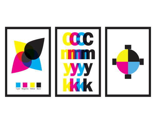
For example, the red packaging of Coca-Cola often evokes feelings of energy and joy, while the clean and minimalist design of Apple’s packaging conveys a sense of innovation, technology, and premium quality.
Small tweaks—like using a playful script for organic snacks or gold accents for high-end skincare—can make a world of difference. The key? Understanding your audience’s preferences and aligning with their expectations.
Communicating Brand Values Through Packaging Design
Your packaging can speak louder than your tagline. It should reflect what your brand stands for.
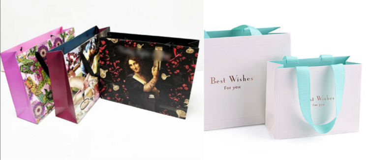
Whether it’s sustainability, luxury, or innovation, your packaging must align with your core values. For instance, eco-friendly brands often use recycled materials and earthy tones to convey sustainability, ensuring authenticity resonates with customers.

Brands like Patagonia follow a philosophy of sustainability in their design, material selection, and production. As a result, their packaging is usually simple, environmentally friendly, and reusable.
In contrast, luxury brands such as Chanel often rely on special finishing techniques—such as embossing and foil stamping—to express their brand identity and premium quality.
Minimalist vs. Bold: Choosing the Right Packaging Style for Your Brand
The battle between minimalist and bold designs isn’t about right or wrong—it’s about what fits your brand.
Minimalist packaging exudes elegance and sophistication, often appealing to high-end markets. In contrast, bold designs grab attention and foster a fun, approachable vibe. The right choice depends on your brand personality and target audience.
Luxury skincare brands, for example, favor clean lines, soft hues, and understated elegance. Meanwhile, snack brands like Doritos thrive on bold colors and dynamic typography. Your choice of style should create a cohesive visual language that aligns with your brand ethos while captivating your audience.
Conclusion
Your packaging is more than a protective layer—it’s your brand’s voice in a crowded marketplace. A well-designed package communicates value, builds trust, and strengthens customer loyalty.
Call to Action
Ready to elevate your brand with standout packaging? Contact us at www.kexinpackaging.com. Let’s craft designs that not only protect your products but also tell your unique story. Comment below with your thoughts or reach out to learn more!