Common Packaging Design Mistakes to Avoid
Ignoring Structural Feasibility During the Design Stage
I’ve seen stunning packaging designs fail before they ever reached production.
Not because they looked bad—but because they didn’t work in real life.
Most packaging problems don’t start in the factory. They start on the design table. When structure, materials, and production realities are ignored early, costs rise, delays happen, and frustration follows.
Let me walk you through the most common mistakes I see—and how to avoid them.
Ignoring Structural Feasibility During the Design Stage
This is where many problems quietly begin.
A design that looks good on screen can become impossible—or very expensive—to produce if structure isn’t considered early.
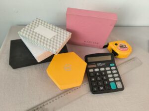
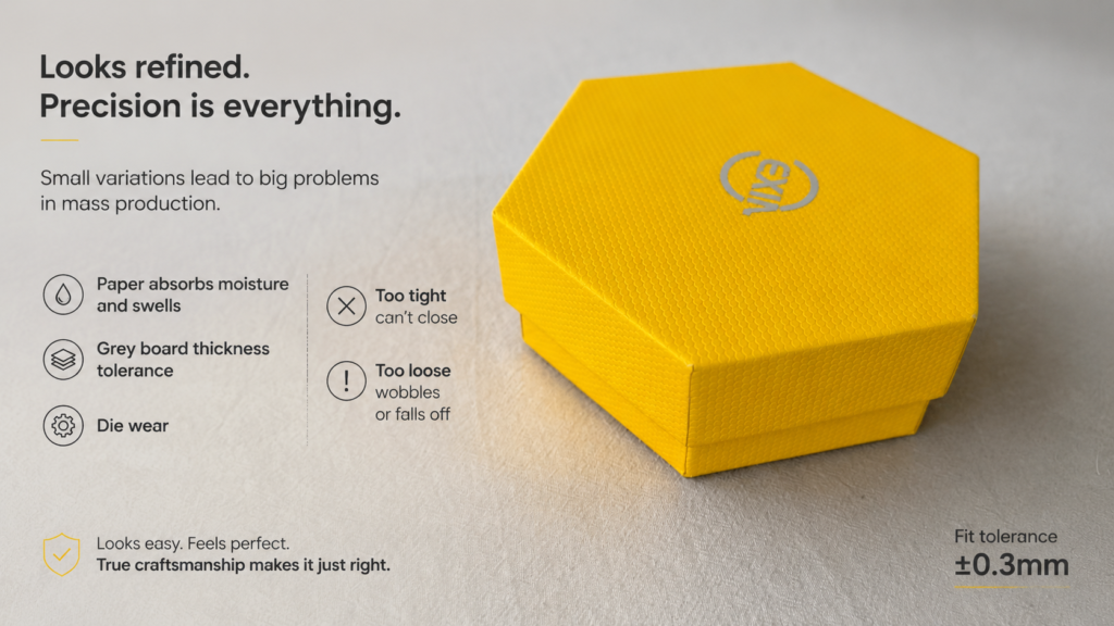
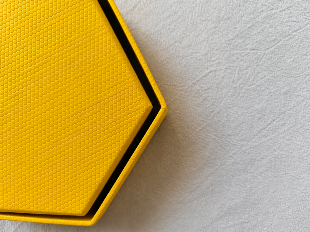
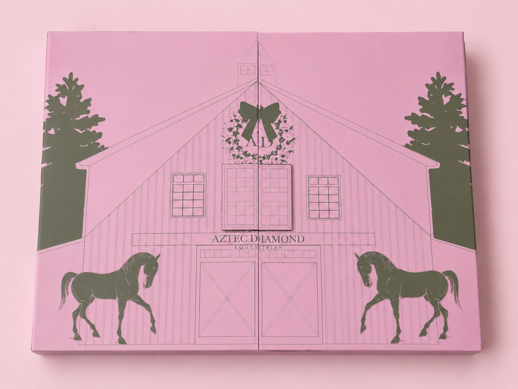
Take this hexagonal box as an example: it looks elegant and premium, but the fit between lid and base must be controlled within ±0.3 mm. Any variation—paper swelling from moisture, greyboard thickness tolerance, or mold wear—can cause the lid to be too tight to close or too loose to stay in place. Such issues don’t show up during prototyping, but can ruin the entire batch in production. Achieving the perfect fit requires highly skilled craftsmanship.
I’ve had designers send me beautiful mockups that simply couldn’t stand on their own.
Why?
Because structure was treated as an afterthought.
Packaging structure decides:
- Whether the box holds its shape
- How it’s assembled
- How it survives shipping
When structure is ignored, factories are forced to “fix” designs later—and that almost always means higher cost or compromised quality.
Good design starts with physics, not just visuals.
Choosing the Wrong Box Type for the Product Weight and Use Case
Not every box can carry every product.
Using a box style that doesn’t match product weight or usage leads to damage, returns, and unhappy customers.
I once worked with a client who used a folding box for a heavy glass product.
It looked great—until customers started complaining.
Light products can live happily in paperboard boxes.
Heavy or fragile products need stronger structures, often rigid boxes.
Before choosing a box, always ask:
- How heavy is the product?
- Will it be stacked?
- Is it shipped internationally?
Matching box type to real use is basic—but often skipped.
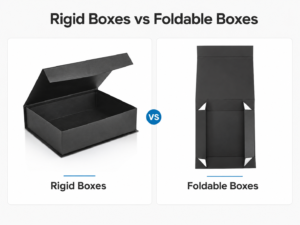
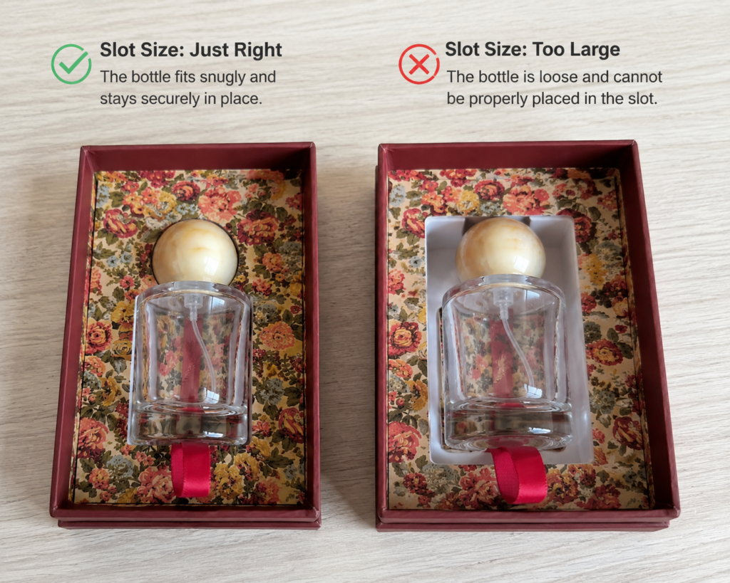
Overlooking Tolerance and Fit in Lid-and-Base Box Designs
This mistake is subtle—but painful.
Ignoring tolerance can cause lids that are too tight, too loose, or impossible to assemble smoothly.
Lid-and-base boxes look simple.
In reality, they’re very sensitive to millimeters.
Paper thickness, wrapping tension, and humidity all affect fit.
I’ve seen:
- Lids scratching edges
- Bases collapsing
- Boxes that only fit some of the time
Good design always leaves room for reality.
Misunderstanding Material Behavior After Printing and Lamination
Paper changes after printing. Always.
Materials expand, shrink, and stiffen after printing and lamination—ignoring this leads to warping and alignment issues.
Designers often assume paper stays the same.
It doesn’t.
After printing:
- Ink adds moisture
- Lamination adds tension
- Paper reacts differently on each side
This is why experienced packaging design always plans after-print behavior, not just before.
Using Special Finishes Without Considering Production Limitations
Special finishes are powerful—but risky if misused.
Foil stamping, spot UV, and embossing require specific conditions—designing without limits causes delays and waste.
The gold foil on the edges of this inner box tends to flake off. Gold foil is a very thin layer applied to the paper surface and cannot withstand strong friction. During assembly, the edges of the inner box must be rubbed to make the paper adhere tightly to the board. Additionally, frequent opening and closing of the box causes repeated friction. Over multiple cycles, some gold transfer or flaking on the edges is inevitable. Therefore, applying gold foil to the edges of an inner box is not recommended; we usually suggest using printed gold instead.
In contrast, the gold on the inside of the lid experiences minimal friction and can remain intact and flawless.
I love special finishes.
But I also respect their limits.
Problems happen when:
- Foil areas are too large
- UV overlaps folds
- Details are too fine
Every finish needs space, pressure, and precision.
Ignoring that reality costs time.
Designing Colors Without Accounting for Paper and Printing Methods
Color doesn’t live alone. Paper changes everything.
Colors look different depending on paper type, coating, and printing method—screen colors are only a reference.
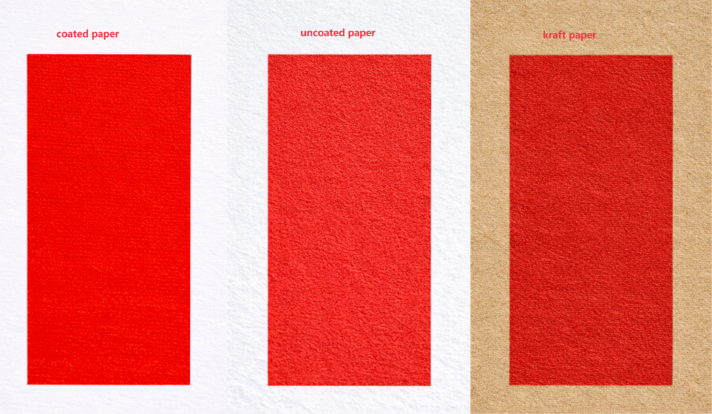
I’ve had clients say,
“Why doesn’t it look like my screen?”
Because screens glow.
Paper absorbs.
Uncoated paper dulls colors.
Kraft paper shifts tone.
Digital and offset print differently.
Smart color design plans for the final surface—not the monitor.
Neglecting User Experience in Opening and Handling the Package
If it’s hard to open, it’s hard to love.
Poor opening experience can ruin first impressions—even with beautiful packaging.
The following box was created for a premium membership gift by a client of a golf club in the UK. Because the client requested very thick, rigid, and high-quality cardboard, the combination with a tearable opening mechanism turned out to be a disaster. The box is extremely difficult to open, and in the end, a blade was required to access it.
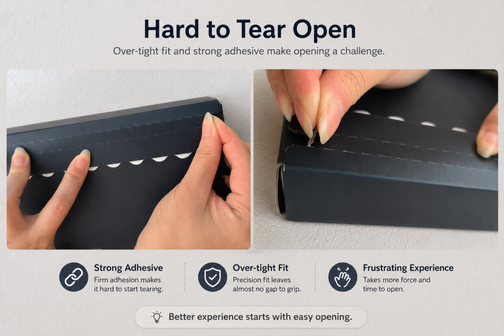
Think about:
- Where fingers go
- How much force is needed
- Whether customers feel confused
Packaging is a physical experience.
If users struggle, the brand suffers—silently.
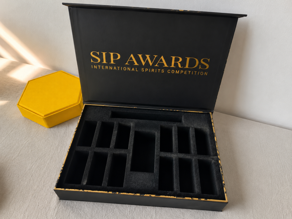
Underestimating the Impact of Internal Packaging (Inserts & Trays)
Inside matters as much as outside.
Inserts and trays protect products, improve presentation, and affect overall cost and assembly time.
I often see inserts designed last—or ignored completely.
But inserts decide:
- Product stability
- Unboxing experience
- Packing efficiency
Bad inserts waste space.
Good inserts create confidence.
Designing Without Considering Mass Production and Cost Efficiency
One perfect sample doesn’t mean scalable success.
Designs must work at scale—what’s easy for 10 units may be painful for 10,000.
In following case, the client’s inner box design was too complex, which meant that after receiving the shipment, a large amount of manual labor was required and significant time was spent on assembly. Later, the client simplified the design to a basic tuck-bottom box.
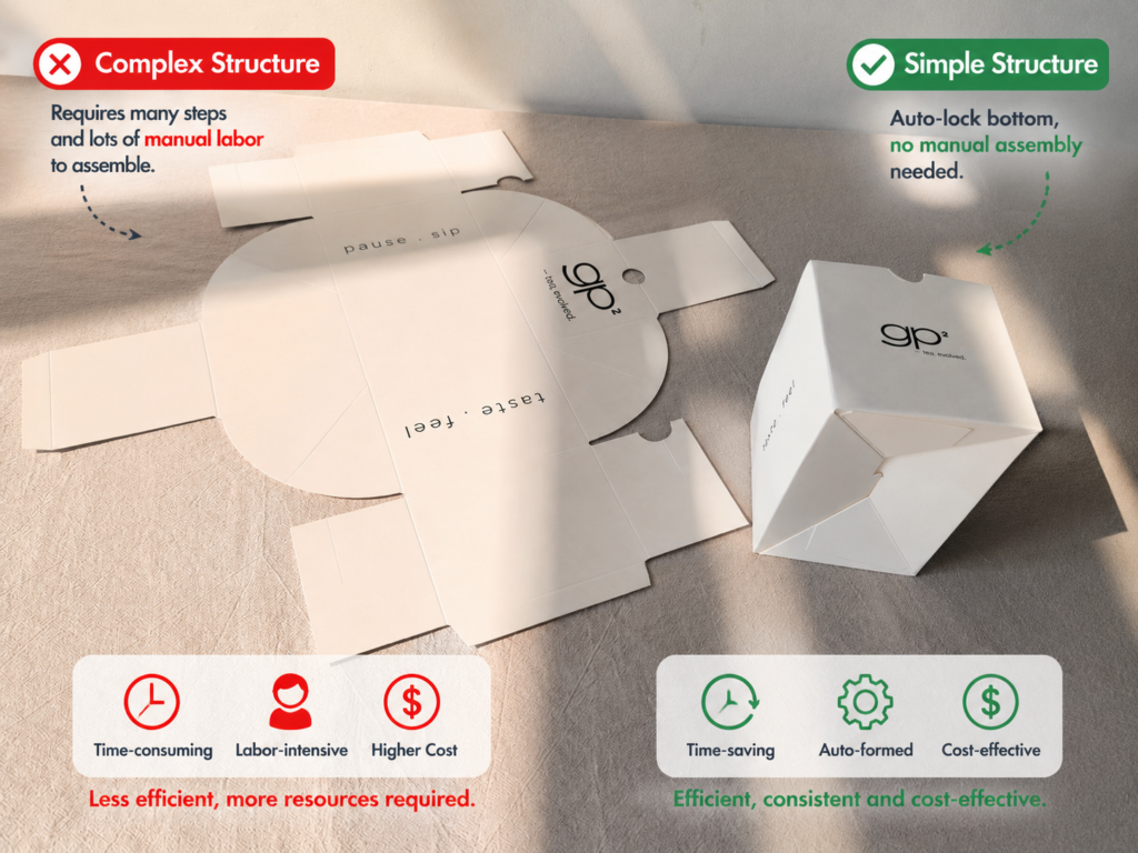
Mass production cares about:
- Assembly speed
- Error tolerance
- Material yield
If a design slows workers down, cost goes up.
Simple structures usually win long-term.
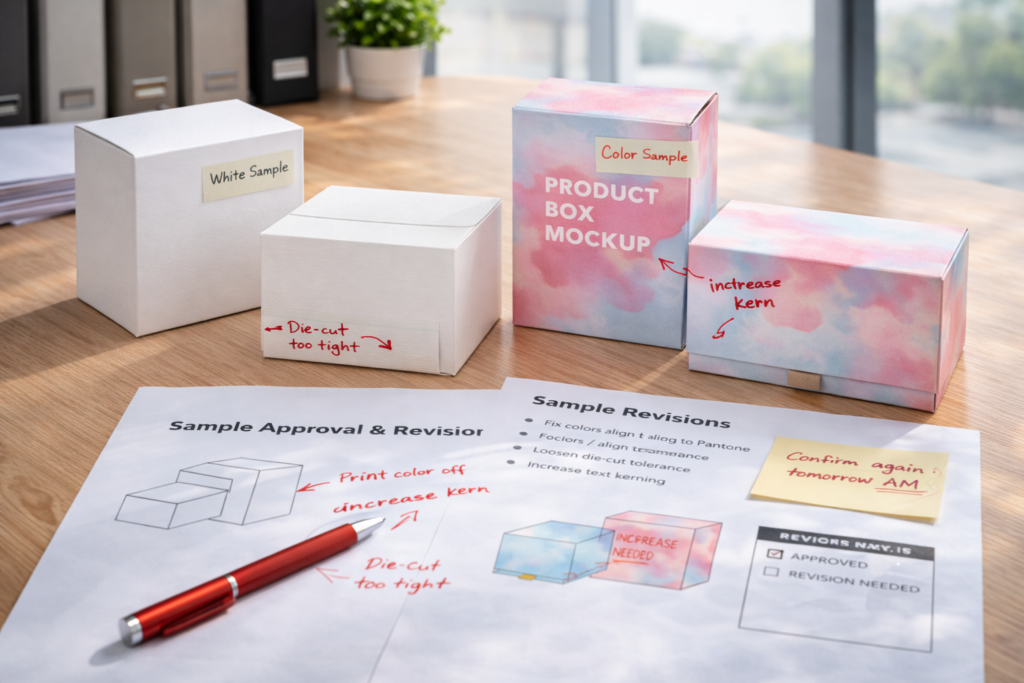
Skipping Prototyping and Sample Testing Before Bulk Production
This is the most expensive shortcut.
Skipping samples increases risk—testing early saves money, time, and stress.
I always say this:
A sample is cheap insurance.
Samples reveal:
- Structural issues
- Color shifts
- Fit problems
- User experience flaws
Fixing problems on paper is easy.
Fixing them after production is painful.
Conclusion
Good packaging design avoids problems before they happen.
That’s where real value is created.